Bounded Space
We think of space in terms of walls, doors and windows and the ways in which they define an area. With layout planning we are used to thinking in terms of room-sized spaces such as a basement, an attic or a spare bedroom. And, of course, there is never enough space regardless of how much is available.
When the parameters are reduced to cameo layout dimensions, the narrative around space is radically different. Where one may have room to design liberally in a basement, such excess is out of the question with a cameo.
We are accustomed to two-dimensional plans that outline the length and width of a space but leave the third dimension of volume to the imagination. A thoughtful designer may look at cross-section views in a complicated design but mostly we are satisfied to know how many two-foot wide lengths of bench work and three-foot aisles we can fit into a given area, with other considerations relegated to whatever is left over.
I think of a cameo design in the same way I would a painting or a piece of built-in cabinetry. There is a finite area and volume to use and to use it wisely, I need to suggest there is more here than meets the eye.
When rendering a three-dimensional image on a two-dimensional surface, I use techniques like linear and aerial perspective to suggest the illusion of volume. Linear perspective is the way parallel lines seem to converge as they extend to the horizon and aerial perspective is the way color shifts toward blue and gray as objects get farther away. However, given the compressed viewpoint of a cameo scene, these tactics may not serve well and in fact, may do more harm than good.
My 13th and North E cameo depicts a very compact slice of urban landscape. At a depth of 14.5 inches the scene is only 68 scale feet deep, and using tricks like forced perspective on the street grid to suggest more depth would look silly. You wouldn’t notice the effect because the viewpoint implied by quarter-inch scale leaves an insufficient amount of room to make the gradual transitions required. The same is true with aerial perspective; there isn’t enough atmosphere or distance involved to significantly alter the color from front to back in a scene like this. I could use a subtle shift toward gray for the warehouse flat but it would need to be very subtle like a wash. Armor modelers use such color modulating techniques to great effect on much smaller subjects than a building, so there is potential in it.

13th and North E
Make mine a small serving please.
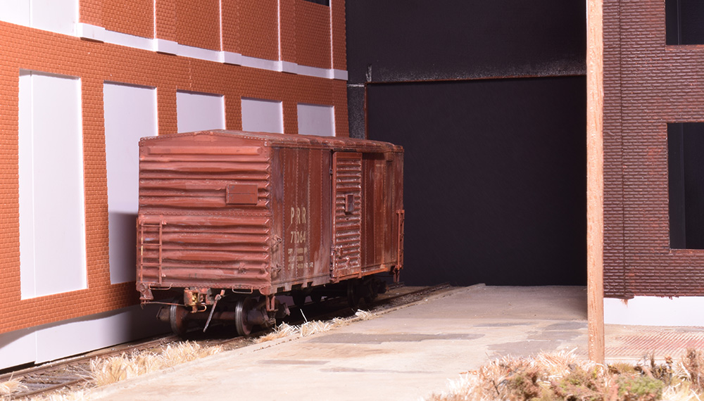
Two techniques I am using are layering and textures. Viewed from the front at a scale figure’s eye level, the scene features a weedy vacant lot followed by a street with concrete pavement, then the rough track and finally, the brick warehouse (photo below). The different textures and surfaces suggest many layers of space when in fact there is very little. Vertical objects like a simple utility pole interrupt the strong horizontal lines of the street and track and further divide and define the surrounding spaces.

Layers of different texture help the eye linger as it surveys the scene. This suggests more space since the eyes take longer to look everything over.

Imagine how flat this scene would be without the utility pole. That vertical line separates the space into left and right and front to rear.
Another technique is contrast. In my case it’s a contrast between open and closed. While many modelers would fill the vacant lot with a lot of clutter or smaller buildings, I feel it’s critical to exercise restraint given the overwhelming presence of the warehouse and corner structure. That clutter free open area provides much needed breathing room and a contrast to the crowded nature of the alleyway created by the two large structures on the other end of the scene (photos below).

The alley provides a contrast to the open area of the rest of the scene.

What’s around the corner?
The railroad had to thread its way through a crowded neighborhood to reach this warehouse. I covered the opening in the end panel for the photo.
This alley strengthens the urban story I’m portraying with this work. Once both buildings and the connecting overhead enclosure are in place, there will be a strong feeling of how the railroad had to thread its way through a congested neighborhood to reach this warehouse. This is why I enclosed this corner of the scene rather than model the factory interior of the corner building. To view the alley, you are forced to peek around the corner, much as you would physically walk around it at full scale. This area also serves as an entrance to the scene, where a freight car or locomotive may appear with little warning.
Although I enjoyed my previous layouts, building and developing 13th and North E has been the most satisfying to date. With its modest size, no single task has been overwhelming or arduous. There is ample opportunity to exercise a high level of craft and the design concepts I’ve shared so far have renewed my enthusiasm for modeling and the potential of quarter-inch scale in this format.
Regards,
Mike
0 Comments