Cameo Planning: Using Color To Set A Mood
For the cameo, I want the feeling of a cold winter day; one that causes you to wrap your jacket tight and turn the collar up against the chill of a biting wind. Where the papery rustle of dried grasses and the groaning tree trunks are counterpoints to the relentless sound of wind.
Creating such an atmosphere doesn’t happen by chance. It takes observation and understanding of the landscape, color and light.
Like many I would take scenery materials out of the bag, scatter them around, dribble on the diluted white glue and call it done. It’s what we were all taught to do. I relied on the manufacturer for the colors and seldom if ever thought about using color deliberately with scenery modeling. That changed as I began to study what other modelers are doing, especially with small dioramas. With these works, the model and surrounding scene present a seamless image where the colors of the two are skillfully blended. I find these examples very compelling, as there is often more atmosphere and storytelling in ten square inches than many layouts manage in 100 square feet.
As mentioned in a previous post, color is the least understood tool we have at our disposal. Used with skill it’s a powerful way to create distance, reinforce a mood and establish a time and place. To set the mood I described in the opening, it begins with the light.
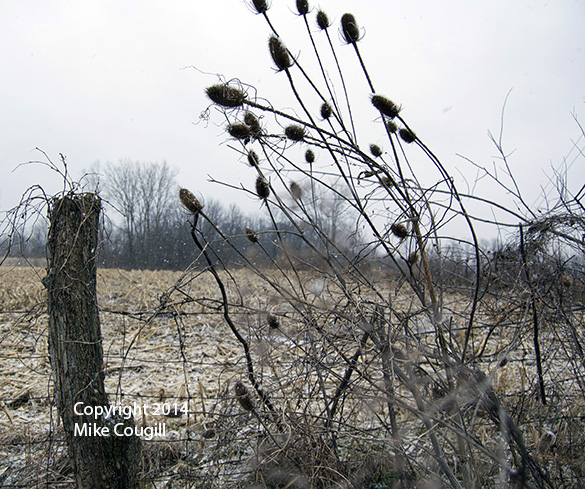
Even though I’m not including snow, this image conveys the type of raw day and mood I want the scene to have. Here the objects look flat due to the absence of cast shadows and strong highlights. While there is a distinct color contrast between the field stubble and distant trees, the tonal range of both is not that great.
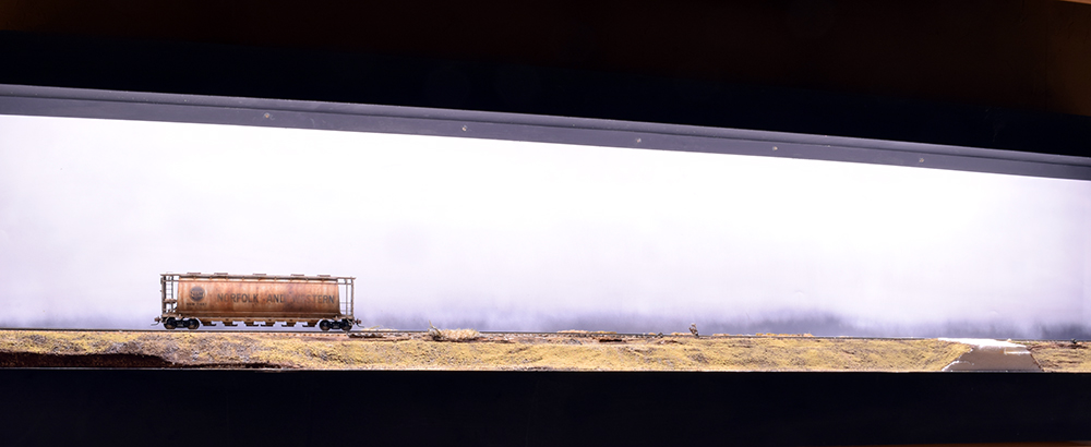
The cameo’s LED strip lights have a color temperature of 4000K which is just below the daylight rating of 5000K. With 1600 lumens each, they have a CRI (color rendering index) of 80, which isn’t bad.The CRI rating defines how accurate color looks under the light. I wanted something that was close to daylight because cooler temperature lights never look right to my eyes. The strips produce a nearly white light that leans toward the warm end of the scale. Under this light, warm colors tend to pop a bit to my eyes, which isn’t ideal for the effect I’m after. However, as more of the finished scenery layers come together, it doesn’t look that bad, since I’m learning how to compensate for the color of the light.
Plenty of flat diffused light.
On an overcast day the light is very diffused and even. The harsh contrasts and directional shadows are absent. With diffused light, the colors of the landscape are muted and closer together in tone. It’s something you have to get out and study first hand and learn to see.
To get away from the patchwork quilt appearance of commercial products I use natural materials where practical and repeat them in mass. The sisal twine I use for tall grasses has the proper color but I enhance it further with washes of muted and grayed yellow tones. For this I lean heavily on Tamiya’s line of military colors. The range of buffs, yellows, browns and other camouflage colors are all designed to mimic natural surroundings. To compensate for the warmth of the LEDs, I push the color of these washes toward the cool side of the spectrum and work to keep the tonal shifts subtle.
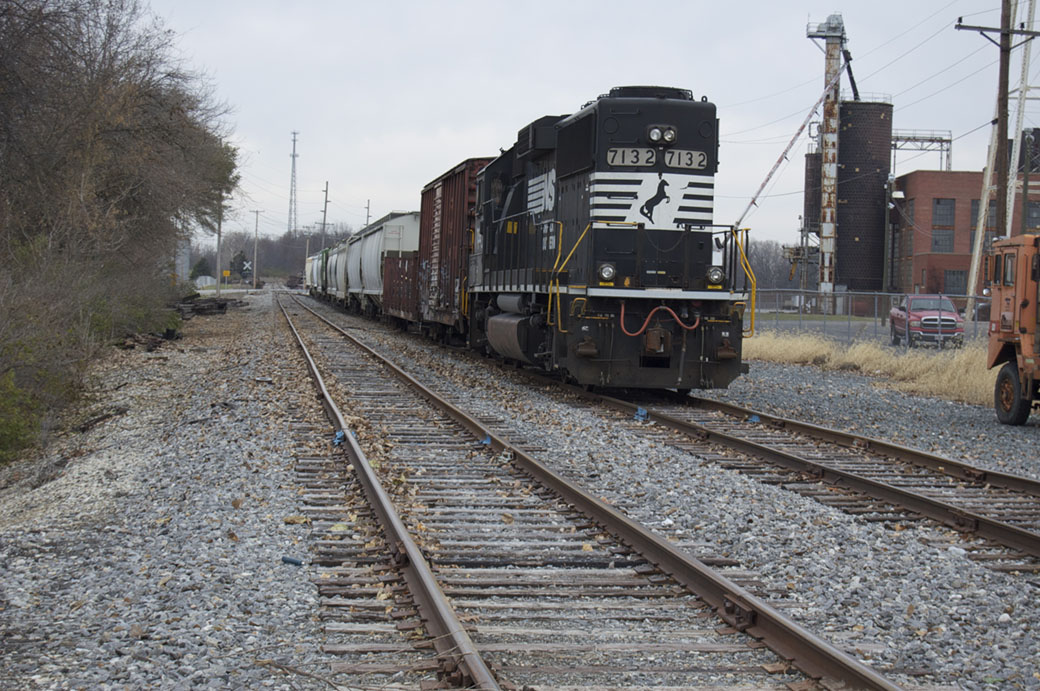
Painting finished scenery is new to me. I experimented with it on the old layout and liked the results. I learned from diorama modelers that it’s a good way to enhance the mood of a scene. I apply the color principles to everything: the landscape, the right-of-way, buildings and roadways. For a truly cohesive effect, it’s critically important to pay attention to the rolling stock. The atmospheric light exerts a strong influence over the entire scene and as seen in the image below, the colors of the two boxcars aren’t as vivid as they would be under strong sunlight. Too often we treat everything separately and as a result one or more items stand out from the rest, screaming look at me. Or worse, everything screams for attention. This creates a discord that ruins the realism we seek.
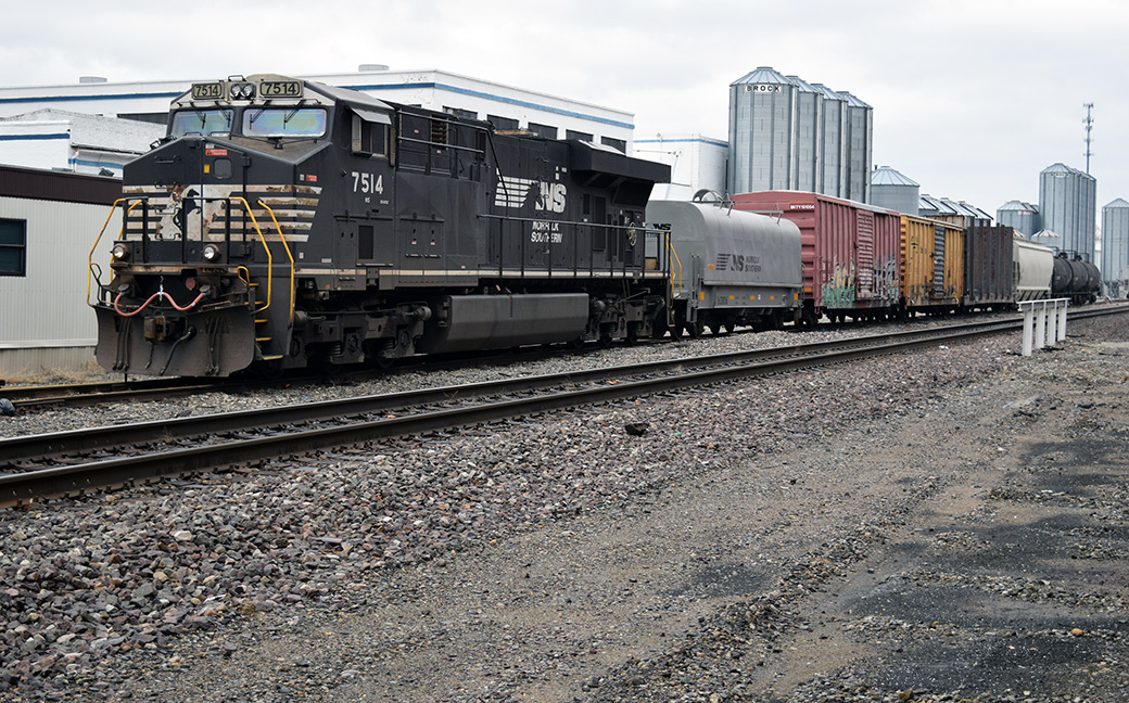
The atmospheric light impacts the colors of rolling stock too. Here the colors of the boxcars and warning labels on the locomotive are less intense than they would be in bright sunshine. Notice how everything comes together in this image and the lead photo. No one element pops outs or screams “look at me!”
I’ve said many times that I believe we’ve barely scratched the surface of scenery modeling. Other disciplines like landscape painting and photography have much to teach those of us willing to learn. From these visual arts, you learn to see color and light rather than individual objects. You also learn to see the relationships between elements and to consider the composition as a whole rather than a collection of pieces. Bringing these skills to my modeling is one of the true joys of the craft that I cherish.
Mike
“To compensate for the warmth of the LEDs, I push the color of these washes toward the cool side of the spectrum and work to keep the tonal shifts subtle.”
I am not an artist: my near-miss grade (a narrow band just below the pass mark) for the subject at school attests to that, but not as well as my teacher’s rueful remark that compared to ability, it was actually the best result he’d ever seen.
I am also mildly colour blind.
I mention these two facts as background to the simple truth that I struggle with colour. When you say you push the colours, how do you mean? It may be a simple question to answer, but are you adding something to the palette, to be incorporated into every colour, and what would that be, to counteract the effect of the warm LEDs?
“Too often we treat everything separately or worse, everything screams for attention.”
This is absolutely one of the top worst mistakes on most layouts. Every building painted as if it was painted yesterday. Many buildings in strong colors. Car models shiny. Billboards, junk, details all scattered and vying for attention. Weathering inconsistent.
We build layouts for a reason. We should be aware of the one or two things we wish to bring forward as the stars and everything else is pushed to a supporting role. Using more dull, mundane, subdued colors consistently across everything, and desaturating them to more neutral values is something I rarely see. But it is what reality looks like.
I think this restraint, the effort of downplaying everything in a consistent manner to keep focus on what matters, is far harder to pull off than most anything we do in building a layout.
Dear Mike,
Higher colour temps (5000-6000k) tend to run “cold(er) white” which can enhance bleak and winter-type scenes (and verdant-green northern hemisphere scenery, as compared to brown/olive aussie scenery).
But how to defeat the “harsh shadow” issue? Simple, difuse the light source. This is achieved by strategic lowering of the overall light levels (I never run LED lighting “uncontrolled”, simple manual dimmers can be had for $AUD3-5, and are easily implemented), and using greaseproof non-waxy baking paper as a cheap diffuser cover. These two techniques completely mitigate “hot spot reflections on the railhead” complaints/issues, and makes for a much “softer” and even spread of light on the modelled scene. FWIW…
Happy modelling,
Aim to Improve,
Prof Klyzlr
Thanks Prof. I appreciate the suggestion and welcome to the blog.
Dave,
I agree completely. I can only think of one example (Mike Confalone’s Allagash) where the entire scene has the cohesive quality you suggest.
Simon,
It’s simple to answer and not simple. Very simply, for cool tones I look for a higher percentage of blue in the color. One color I’m using on the ground cover in the background is Tamiya’s XF-22 (RLM gray). I don’t apply it full strength, rather I dilute it 80-90 percent with denatured alcohol to create a very thin wash. My methods are haphazard and I go by eye for the final effects. For much of the cameo’s grasses and scenery I’ve settled on four colors from Tamiya: XF-52 (Flat Earth), XF-72 (Brown/JGSDF), XF-51 (Khaki Drab) and the aforementioned gray.
I use the XF-52 and 72 in the foreground colors and bring in the others as I move closer to the backdrop. As mentioned in the post, I apply these washes to everything and I like the cohesive impact it brings. Individual elements still stand out but don’t clash or compete with each other because there is an overall consistent tone to the entire scene. An experiment I’m trying is using the Kahki Drab more heavily near the ends of the scene where it transitions into staging. (Think of the vignette effect on an older photograph.) I like what I see as the drab colors don’t attract the eye. Instead the eye is attracted back to the lighter colors nearby. Again, such effects and transitions between them are very gradual.
Even though I only have a rank beginners knowledge of color theory, I see that a more detailed explanation might be helpful for all of you. I’ll work on that for the next post.
Mike
Mike,
I’m a big fan and appreciate you taking the time to share your knowledge and for free.
This entry really put things together for me. For the past couple of months I’ve been trying to figure out what I need to do to make my layout seem right to me. Like you said in the first post about the cameo “What Now?” My layout is about what I want but I still was having trouble figuring out what it was I was missing. I’m modeling Oregon “wet, gloomy, dark,” What you just wrote is what I needed. You don’t see a lot of pictures in the rain or on a dark gloomy day. It makes for bad pics and not many people want to stand out in that weather. I need to find the right materials and tone down all the colors. I won’t keep rambling long story short your blog just helped me figure out the missing link to what I was looking for✌️🚂💨
Thanks for the kind words Patrick. It’s gratifying to know the posts are helpful for modelers. I suggest you keep looking at the landscape. It takes time to get past our preconceived ideas and learn to see what’s actually in front of us. The next post might help you also.
Mike