Light And Color
The hardest thing I do is to keep the mindset of a student. When a reader emailed me and mentioned a book on light and color that he found useful, I looked it up on Amazon and purchased a copy. While a lot of the way light and color work in a painting doesn’t apply directly to what we do, there is a lot that does. Much of the material in the book was familiar although the truth is that most of what I know is from trial and error over many years. Simon’s comment on the last post helped me realize that many of the terms and concepts I take for granted are unfamiliar, even foreign to most of you. This post offers a (very) brief explanation of a few of them.
If we’re going to take scenery modeling seriously, a key idea to remember is that light has a color and temperature that impacts everything. Natural sunlight is a strong white light that is more intense than any artificial source we would consider for a layout. Volumes have been written and argued over about this topic and since I don’t have anything substantive to add, I don’t want to get into that useless drama. However, I’m eagerly waiting for someone to break the mold of our mediocre lighting techniques.
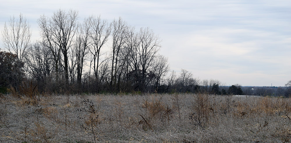
In addition to the sun, the sky is a giant reflector that influences the colors of the landscape. Consider the opening image. On a day with heavy overcast, the light will be diffused and soft. The cloud layer will cast a tint that renders the color of everything below quite dull. Thanks to the diffused light, the contrast between light and dark will be less intense because more light reaches into the shadows. Also, the forms of objects will appear flat and less defined. It’s counterintuitive but on an overcast day, color is often brighter and purer because the intense sunlight tends to wash out any color.
Color
Warm and cool refers to the amount of yellow or blue a given color has. In general terms we think of reds and yellows as warm and blues and greens as cool, yet that is simplistic. Reds and yellows can have cool properties while greens and blues can be warm.
Hue is the name we give to a color such as red, green and so on, while tint refers to the intensity of a color. Adding white to red lightens the tint toward pink, while adding blue darkens the tint and pushes it toward purple. Value on the other hand describes the degree of light and dark. That pink tint may be light in value while a deep rich blue has a dark value. Again, this is all quite relative and general but these properties are useful to know in modeling, as we can use them to great advantage.
We are more familiar with atmospheric perspective: the phenomena where colors and objects get less distinct the farther away they are. As we look through more and more layers of water molecules in the atmosphere, the color becomes less intense.
Rethinking Color On A Layout
It’s a matter of taste but the colors of commercial scenery products are too garish to my eyes. Using commercial products out of the bag fails to take the reflected light of the sky into account. Combined with the bright colors of unweathered buildings, rolling stock and even ballast, everything is competing for attention and the results are often unsatisfying.
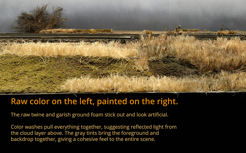
Like many, I’m happy to slop on a coat of raw or burnt umber over the bare plaster cloth just to get rid of all that white. However painting the finished ground cover is something most don’t consider. Whatever comes out of the bag is what you see. With this project I’ve learned that’s selling the craft short.
As mentioned in the last post, I’m going for a very specific mood for this scene. Beyond that however, manipulating the color allows me to focus attention where I want it and away from places I don’t. An area I want to draw you away from is the end of the cameo and the transition to the staging. Inspired by military dioramas and other works, I’ve deliberately lowered the value of the colors here (photo below).
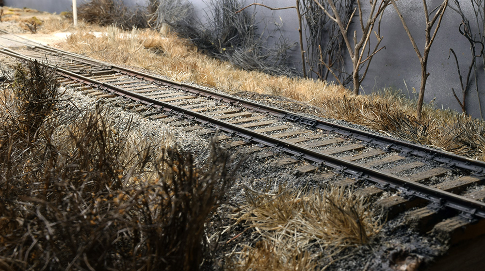
Our vision is drawn to light, movement and contrast. At the ends of the scene, I’m gradually building up dark tones on the ground, foliage and roadbed. You can see how the color of the rails shift from warm browns on the left to the cool gray on the right. To strengthen the impact, I used washes of the same gray on the surrounding landscape and roadbed near the cameo’s edge. Instead of trying to hide the transition with archaic tricks that would be out of context and fool no one, this darker area reduces the contrast so that the eye is naturally drawn back toward the lighter colors at the center. It’s important to reduce the value of everything, otherwise the eye goes right to any light color.
The effect on the right edge may not look that strong in the photo but it’s quite noticeable in person. I still need to adjust the values here and this is only the first step of more to come after the adjacent cassette is built and in place.
To create scenery with impact doesn’t take that much extra effort. Admittedly, the ideas presented in this series won’t be for everyone since old habits die hard and many people simply won’t care about them. If you want generic, paint-by-numbers scenery, the experts from you-know-where have it covered. I don’t believe in formulaic shortcuts and the hobby has enough to satisfy every taste. What I do believe in is sharing principles and concepts that help you to grow and follow your own path. I believe in challenging the status quo with ideas that might expand your understanding and enjoyment of what this craft can be and in the process, I’m learning right along with you because I want to remain a student of this craft.
Mike
Mike,
Is this color theory/light why a lot of modelers take photos outside? Interesting read, I feel like I learn more in each of your short posts than a whole magazine of articles. It would be interesting to see a comparison of your layout in your interior lighting, and outdoor lighting. I would imagine that the impact of the transitions would change? For good or for worse?
Now the bigger question, how to apply this in my own modeling.
Craig
It could be Craig. I suspect the sharper highlights and shadows of natural sunlight is an eye opener about what a model actually looks like compared to the weak artificial light of most layouts. I’ll see what I can do about shooting the comparison photos you suggested.
Mike
Mike,
Funnily enough, I was recently designing a poster for a local event. Nothing fancy, but the organisators requested a lot of elements around the main theme. I knew I couldn’t make them make concessions on these elements, but I knew I had the possibility to use color, value and hue to organize the information. My goal was to make sure the eye would be drawn to the most important feature of the poster. In a similar fashion you described, the main object was bright and colorful while other object got much more washed down. Important elements had constrasting, almost black, contours, while the rest was drawn with toned down browns, buff and other colors. It didn’t take long to get a cohesive result out of a chaotic starts. Now, the secondary elements support the main theme instead of being in competition. This his hardly rocket science, something most people will understand the moment they are aware of its existence. But isn’t disturbing that even with my artistic background, it barely came to my mind to apply these basic ideas to layout scenery…
Terrific stuff, and thank you.
That last photo is amazing: even though I know what you are doing, my eye is still drawn to the lighter, left hand side of the composition.
Gosh it must’ve been at least twenty years ago, I was displaying a layout I’d built at a local show. Among those that stopped to look and talk was a gentleman who introduced himself as a builder of museum dioramas. He had some wonderful feedback but among it was a comment about adding a coloured wash to the scenery. I thought I understood his point but when I got home and tried it, I realized I didn’t. I couldn’t see the end result so found it hard to figure out what I was doing. Your final photo in this post really helps me understand the potential of this approach.
So, wouldn’t it be neat to design the colour and textures on the layout with the lighting as one consistent scheme? We don’t do this now. We execute them as separate activities in complete isolation. They only meet by accident since they share a common volume.
I’m excited. I feel motivated.
Thank you
Chris
Thanks everyone for the always insightful comments.
Matt,
It’s only taken me forty plus years to reach this point. Old habits and ideas do get firmly entrenched in the mind.
Simon,
I hope this helps with your question from the last post and your eyes are doing exactly what I hoped for. There is more to come in this area.
Chris,
As always you go right to the heart of an idea. Integrating the lighting and scenery colors produces a cohesive outcome that looks more natural, in my view anyway. Once you see the impact, the possibilities open wide. It works just as well for summer modeling with trees in full leaf as the winter season I’m modeling. It really boils down to understanding the quality of the light you have, regardless of whether it’s incandescent, fluorescent, LED or whatever, and learning how color reacts under that light.
Mike
There’s just so much genuinely exciting potential here! The way you’re shading the colours of the scenery to accentuate the shadows from the light allows one to cooperate with the other. A scenic texture, like grass, provides both colour and texture. We depend on it for this. By shading the colour toward dark you begin removing it from the scene without removing the texture it provides to the scene.
You’re breaking innovative ground. Designing in this homogeneous way is real design. It’s a kind of thinking absent in this hobby.
Thank you
Chris
“A scenic texture, like grass, provides both colour and texture. We depend on it for this. By shading the colour toward dark you begin removing it from the scene without removing the texture it provides to the scene.”
Hadn’t thought of it quite like that Chris but I like it. -Mike
“Instead of trying to hide the transition with archaic tricks that would be out of context and fool no one, this darker area reduces the contrast so that the eye is naturally drawn back toward the lighter colors at the center.”
– In response, “Oh what a tangled layout we weave, when first we practice to deceive.”
I really appreciate your emphasis on drawing attention towards the subject by toning down the background, instead of focusing on creating a manipulative background in hopes that the actual subject of the scene will somehow appear more realistic. It may not seem so at first, but there is definitely a difference.
I’ve seen quite a few layouts in person and probably surveyed thousands online in search of inspiration, but there have been virtually no instances in which I have been “fooled.” Yet this is the approach that the vast majority take in developing a scene. When I study pictures of both your current and past layouts, I am once again in no way “fooled”. I can tell it’s a model. Yet the scenes on your layout conjure up the same emotional response that standing trackside in real life does. And after all, isn’t this the ultimate goal? Not to create an “image,” but a “world.” You’ve really hit the nail on the head this time.
Thanks for all the inspiration,
Clark
Hi Clark,
Thanks for the kind words. As Matt suggested in his earlier comment on this thread, it took him a long time to realize he could apply the concepts he uses professionally to his layout. My ongoing question is: Where do we want to go next? What do we do now that we have an abundance of solutions for the basics of building a layout? While operations and this whole modeling jobs idea is interesting to many, it isn’t a panacea for everyone. Can a model railroad evoke an emotional response? For you, at least, the answer is yes and getting there will require a different discussion and set of ideas. I’m eager to look beyond the obvious sources for inspiration and new ideas because I believe those sources simply repeat the status quo and sell the potential of this craft short. Appreciate your comment.
Regards,
Mike
“Can a model railroad evoke an emotional response?”
You have talked before about what compels us to build a model, so I would like to rephrase the above question:
Can an emotional response inspire a model?
Yes, absolutely. I dare say that’s why most of us pursue this craft, to capture or recapture such a moment.
Mike
So, one definition of “success” might be that the model evokes the emotional response that inspired it?
I grant that your emotional response will be different to mine, but if the model evokes the response that would have inspired me, then it has been a success.
I can go further. Not only did Barry Norman capture the essence of the prototype as shown in photographs of Lydham Heath, but the “feel” of that area of Shropshire – the same soothing, restful, calming emotional response comes to me from his model (in photographs or when operating) as I get from photos of the prototype and visiting the area. The prototype Bishops Castle Railway was a genuine “mixed train daily” service going from nowehere much to somewhere of no great importance, via the back of beyond. It closed in 1935! But there were some freight-only lines in the area until the late 1980s, which had single traffic (railway ballast) trains trundling slowly through the area, empties in, loads out, on a daily basis, stopping at road crossings for a member of the train staff to stop the traffic with a red flag, and never getting up to much speed. This is equally appealing to me.
This might be one reason why I rarely enjoy visiting preserved railways: too much going on!
Mike,
showing great insight, and communicating and illustrating it so clearly, thank you. Interestingly Martin Goodal’s Burford Branch (https://www.scalefour.org/forum/viewtopic.php?t=1846&p=59966#p59956) is putting this into practice in a different but related way.
Thank you Matthew. I have a couple of the MRJs that feature his layout.
Cheers,
Mike