In the 1970s I discovered the work of artist Andrew Wyeth. Love his work or hate it, it’s hard to deny the power certain paintings of his have. I’m thinking specifically of Dil Huey Farm (a portrait of a evocatively shaped sycamore tree, painted in 1941), Christina’s World (perhaps his best known work, painted in 1947) and Brown Swiss (a portrait of Karl Kuerner’s farm, painted in 1957). While these three are all egg tempera paintings, I’m also drawn to his drybrush watercolor studies, which often stand on their own as separate works.
What each of these paintings have in common is how spare they are in terms of subject matter. In each he stripped the composition down to the main subject, eliminating the surface prettiness a lessor artist would have focused on. By eliminating and eliminating what doesn’t matter, he gives each work a greater presence and power to hold our attention. We are forced, in a manner, to confront the subject of each work and our feelings about it.
Excuse me; this is supposed to be about railroading.
As I’ve presented over the past weeks, I’ve made extensive renovations to the trackwork and scenery, because the layout I had built over the last three years left me a bit uninspired. I’ve also realized that for a creative person, the goal is to create something. In the end, having it is secondary.
Thinking through the ramifications of the changes and the point I’ve come to in this craft, I’m looking at the layout less as a model and more as an ongoing artwork. As such my mindset is changing from modeler to artist. (I know, a loaded term), with regard to how I approach a project.
Having wrapped up the mill area and satisfied with the changes made, I’m now looking at the middle section. That vast expanse of nothing-much-happening between the yard on the south end and the mill on the north.
Model railroad thinking, would fill this with whatever caught my fancy, typically, more track and tiny, cutesy buildings that represent nothing. Not even close to my cup of tea these days. In actuality, this space will remain featureless, being little more than a wide expanse of gravel driveway connecting Mill St. to the yard along with overgrown background foliage inspired by the surroundings of Valley Junction.
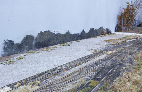
As you see here, I’ve gotten a start by bonding a layer of Woodlands Scenics ballast in place and setting some distant trees made from a torn floor scrubbing pad. A run down chain link fence and more foreground growth will ease the transition between the two. I’m rethinking the presence of the temporary mobile office.
Having this much open space on a layout in any scale flies in the face of convention. With space allegedly so precious and hard to come by, wasting it on nothing, is supposedly a sacrilege. Or so we’ve been conditioned. This is where the misunderstood power of empty space comes into play. As in Wyeth’s rendition of Brown Swiss, the off-centered mass of that stark farmhouse to one side of the panel is counterbalanced by the empty field of the rest of the painting, the two making an asymmetrical composition with beautiful sense of balance.
Recently reminded of this principle, I’m reconsidering the rest of the scenery on the layout. As it stands now in my mind, things will be far more open and spare looking on this section and the yard area than my original efforts.
As with the reduction in the amount of track, by making the mill a prime focal point on the entire layout, it will have tremendous power to draw and hold the eye. With the Mill Street crossing acting as the visual fulcrum for all the empty space to the south, the whole composition of the layout will reinforce the feeling of solitude in the abandoned nature of the mill buildings and convey a strong sense of place and atmosphere. By not cluttering the layout with endless features that add nothing, I’m allowing the elements that are there to speak with greater clarity. Isn’t that the destination many of us are trying to get to with our modeling?
Regards,
Mike
Mike,
What an interesting post!
the off-centered mass of that stark farmhouse to one side of the panel is counterbalanced by the empty field of the rest of the painting, the two making an asymmetrical composition with beautiful sense of balance.
That really does fly in the face of convention, where we are encouraged to maintain visual balance by either having a central focus point flanked by less-“featured” scenes, or a central third as an open area framed by “interesting” outer sections.
A spare approach can be very effective. Many years ago (maybe as many as 15) I visited a show, where the centre piece was the host club’s very large 00 layout, with multiple stations and of a size that makes one think, “American basement” (I am aware that this is a stereotype, but I think we all know what I mean). Despite the vast size of this layout, the scene which drew my eye was one of a series of carriage sidings next to the approach to the terminus. It drew my eye because other than a single, small Bo-Bo diesel loco, the sidings were empty. As the layout was set in the 1970s, when “rationalisation” had started (less stock, due to scrapping) but was not yet in full flow (track was still in place, even if unused, and land had no been sold off), and as this was the period when I started to notice railways in more detail, the scene was one I could relate to: I had noticed similar sights many times on journeys into London. The fact that they had some problems in the fiddle-yard and the train service was limited only added to the realism!
Keep on provoking us!
Simon
As Simon says, interesting.
I see a lot of modern image urban set layouts in particular that seem to have been built with no aesthetic sense. Yet Inkermnan St long ago showed how an urban setting can still be visually arresting, if not exactly beautiful. Personally I find that space intriguing.
But then the question arises of what can be legitimately, or perhaps rather, successfully, manipulated in search of an effect.. Especially for instance if we want to compensate for the inevitable compression of a prototype location into a modeled space. I’ve often been charmed by a shot of a prototype location taken from one viewpoint but then disappointed when I’ve seen it from another viewpoint, or even just taken with a different lens.
Food for thought.
Thanks.
James
Hi Simon,
With these posts I wonder if I haven’t fallen off the deep end. That makes your comment all the more appreciated. My most active period of railfanning was during the mid-to-late 1970s, a time of much retrenchment and consolidation among American railroads too. I have many similar memories as you described, of quasi-abandoned track and buildings sitting idle. These have influenced my subject and modeling choices for the last forty years.
The self directed study of art and design principles over the years is also impacting my layout, as I now see so many applications between the two. I think the possibilities for a different way of looking at layout design are worthy of further study. I see an artistic approach to study and research prior to modeling as having a lot of value for understanding our chosen subjects. Learning to see what is there instead of what we’ve become conditioned to expect can be a revelation. This is why I post so much about my findings in other disciplines.
Regards,
Mike
Hi James,
I think one of the most underutilized principles in design is understanding the relationship of one object to another. Not just in terms of size, but also the distance between them. We’re conditioned by decades of hobby writing that more is always better given the typical space constraints we deal with. Yet, in a small space, packing in more and more, makes the space feel even smaller. Think of a small room stuffed full of furniture to the point of overcrowding.
The same principle applies to layout design. As British exhibition layouts have brilliantly demonstrated, the smaller the layout, the greater restraint must be applied in its design. This is something my countrymen seldom grasp due to our comparatively larger available spaces and bigger is better mindset. I’ve discovered the truth of this with the I&W, in using a larger scale in a smaller space.
Regards,
Mike
British models have moved on a long way from the days where Plan of the Month was an exercise in cramming as much track as possible into a small room, but in many cases this has been replaced by a desire to cram in as many, often amusing or quaint scenic cameos. The whole becomes less than the sum of the parts and the visual engagement is constantly interrupted.
Good composition I’m sure encourages a visual journey across a layout that leads to a more active engagement. Emptiness is part of the mix, but I’ve seen layouts that over do it. I’ve also seen a lot of layouts that have worked well in photographs where a perspective and a viewpoint are controlled by the choice of lens, aperture and lighting but in the flesh, especially in an exhibition hall, look totally different.
Incidentally having messed up the lighting on my current diorama layout I’ve been thinking about another question as well. When I’m taking photographs I think a lot about shade, but when modelling I think, like empty space we ignore it.
Regards
James
Hi James,
Interesting point about shade. I have to confess I’ve never considered it as a design tool but now aware of it, the idea excites me with its possibilities.
Visual artists are taught various rules of composition, one being to feature a center of interest, typically a single object, perhaps one blossom in a grouping of flowers, as the prime focal point of the painting. We are taught how to use the other tools of art: line, shape, light and shadow to lead the viewer’s eye around the canvas in a sort of nice little stroll to and from the main focal point.
Such a principle has application to layout design, both as a whole and individual scenes, yet we seldom apply it, mainly do to ignorance of the principles involved.
The differences between a live view and a photo is of course the ability to switch viewpoints in person versus the fixed composition of the photo. Modelers, like stage designers, try to limited certain views but unlike the theater, where we are seated in one place for the duration, viewing a layout is a dynamic experience of changing viewpoints. Some better than others obviously. Your point about the difference between a controlled photographic presentation versus a fluid one in a less than ideal environment opens the lid of Pandora’s box. Clearly, reality isn’t always what it seems.
Regards,
Mike
I neglected to state the obvious in my reply. All those points go out the window the instant a train appears, as it becomes the focal point.
Mike
Mike,
I think in exhibition halls the focus is usually on a mix of ensuring even illumination and minimizing the impact of the often strange ambient lighting, rather than evoking a mood, which is I’m sure an order of magnitude harder.
The moving train needn’t conflict with the composition, the two can be in harmony. Again building a diorama layout I realsied that I had to think what the layout would look like both with and without stock in place. Which brings us back to Simon’s small loco in the otherwise empty sidings.
Regards
James
Excellent post Mike. I’ve been thinking about clutter in other works of art and connecting those thoughts to model railroading as well. Your post serves as the backdrop to a post I’m working on for my blog.
I really like the way you’re able to create realism though detail and a lack of clutter.
Hunter
http://ontarioinhoscale.wordpress.com/
Hi Hunter,
Thank you for the comments. You’ve also written a thoughtful post. In looking at Miller’s beach scene, I saw many parallels of different modeling techniques in his use of flat color fields. The objects in the scene clearly read as sand, water and distant landforms, yet the lack of specific detail and individual textures leave room for the viewer’s imagination as you pointed out.
I’m more drawn to those textures in my modeling and prefer to pare down the number of actual objects in a scene, thereby opening up the sense of space visually.
Regardless of the approach, it’s good stuff.
Mike