There are a lot of modeling pages and photo galleries online and while the work is often first-rate, some of it doesn’t seem right to my eyes. Modelers are drawn to extremes. The funkier, more dilapidated or derelict the surfaces and textures are the more we like them. However, when every clapboard, shingle or foundation stone is a work of art in its own right, the eye doesn’t know where to go first. Our eyes can only focus on one thing at a time and when everything has been highlighted and outlined to the extreme, our gaze bounces back and forth leaving us confused or overwhelmed. Instead of directing our eyes around the model, the maker throws the whole bucket of content at us all at once.
Our eyes can only focus on one thing at a time and when everything has been highlighted and outlined to the extreme, our gaze bounces back and forth leaving us confused or overwhelmed.
What’s A Hierarchy In Modeling?
A visual hierarchy is about making choices. In a painting an artist will establish a center of interest that attracts the eye first, with all other elements providing a path to that focal point rather than competing with it. Artists do this using color, the contrast between light and dark; the degree of detail, and implied or literal visual lines.
In model building we tend to focus solely on techniques. Whether it’s a single model or a larger scene, it’s easy to get carried away with drybrush highlights or wood grain effects. Furthermore, we tend to exaggerate these techniques resulting in a cartoon-like appearance that detracts from the overall presentation of the model. As with a painting, the solution to this problem is to provide a path for the viewer’s eye to travel around the model.
As with a painting, the solution to this problem is to provide a path for the viewer’s eye to travel around the model.
Establishing The Hierarchy
The 13th and North E cameo depicts a congested factory setting in an older neighborhood. At 15 by 48 inches it’s a small canvas for quarter-inch scale. As such, it would be very easy to overwhelm viewers by overcrowding or excessive detail. To prevent that, I’ve established a hierarchy of emphasis with a visual path through the scene for viewers to travel.
I want you to focus on the siding and warehouse it serves. The corner building, the street grid and vacant lot are supporting elements that reinforce the urban theme and direct the eye where I want it to go. At four feet long and eighteen inches high, with ten loading doors and twenty plus windows, the warehouse automatically becomes the center of interest. As the largest structure there is a lot to digest visually. Rendering the entire façade with the same level of emphasis could overwhelm the eye and overpower everything else. Instead, I plan to use contrasts of light and dark along with color to break up the large building into manageable areas of focus, yet still let it read as a single entity.
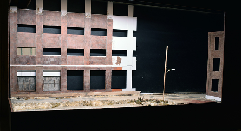
Only half of the warehouse is seen here. When completed it will extend the length of the cameo.
The cameo’s open corner with the strong lighting and unobstructed view frames the scene (photo above). This portion of the warehouse has the strongest colors to draw the eye. Secondary focal points are one or two loading doors with remnants of peeling paint that distinguish them from the others. The mortar lines on this end will be more obvious but not to the point where every brick screams for attention. To further focus your gaze, the upper portion of the warehouse will feature darker more muted tones to shift your focus back down to the siding.
The far end of the warehouse is in a narrow alley formed by the corner building that disguises the entrance hole in the end of the module. A pair of enclosed overhead conveyors fills the air space above the hole. The interior of any exposed fascia paneling is painted a flat black to make it disappear visually. This area has limited sight lines, so the colors and contrast here will be less pronounced. Because I planned for a photo angle through the entrance hole that looks down the siding, the entire warehouse features a consistent level of physical detail but on this end those details will be muted so they blend readily into the surroundings. This is a choice that serves the primary center of interest and de-emphasizes the entrance/exit hole.
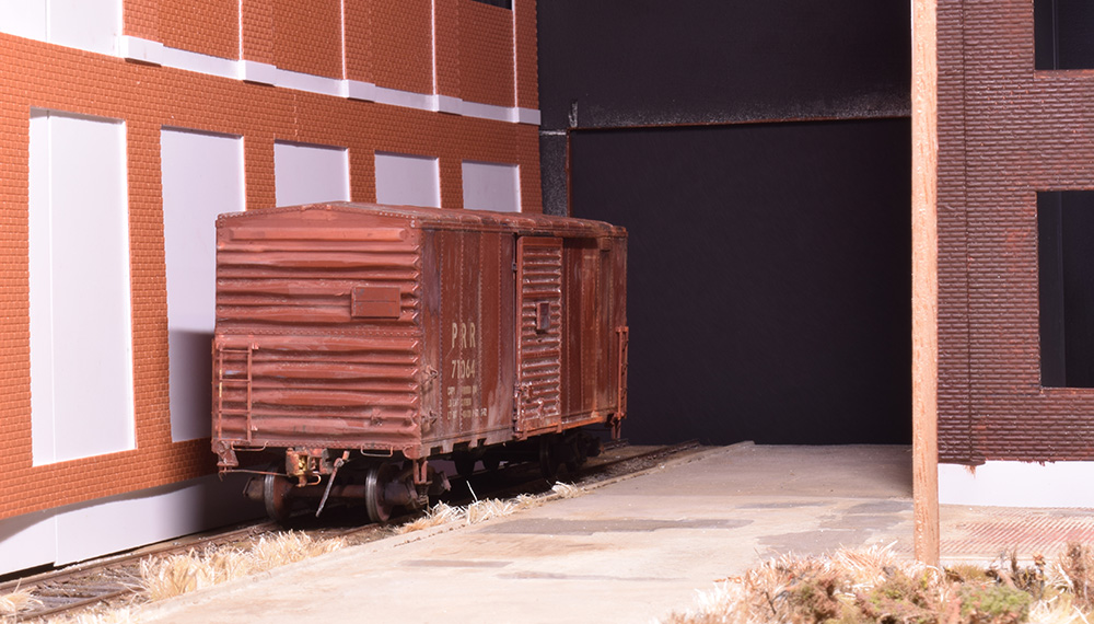
This end will have limited sightlines when finished, therefore details and contrast will be muted, so they don’t distract from the center of interest.
Moving Down The Hierarchy
The siding is an important supporting character. With its close proximity to the warehouse, it can sustain a high level of detail, color and texture where such are required. Like the warehouse, the emphasis of the details will be modulated to direct one’s gaze.
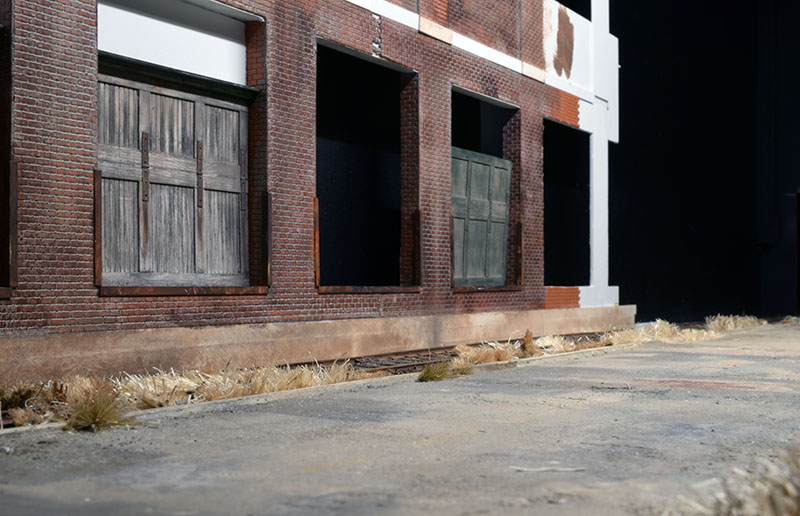
The siding plays an important supporting role to the warehouse.
The street grid plays a supporting role that reinforces the urban theme. Both street surfaces include brick texture. This repetition of a single element brings a cohesive quality to the scene. As a secondary character, the brick pavement has a different treatment, being more weathered and muted in tone as a result of its horizontal orientation. The mix of pavement types on North E Street have a modest amount of 3D texture, too much would compete for attention with the warehouse and siding and draw the eye. The bulk of the effect here is done with color and contrast. The streets also act as leading lines that direct the eye in and out of the composition. When viewed from either end, North E Street carries the eye along the siding and warehouse façade deep into the scene (photo above).
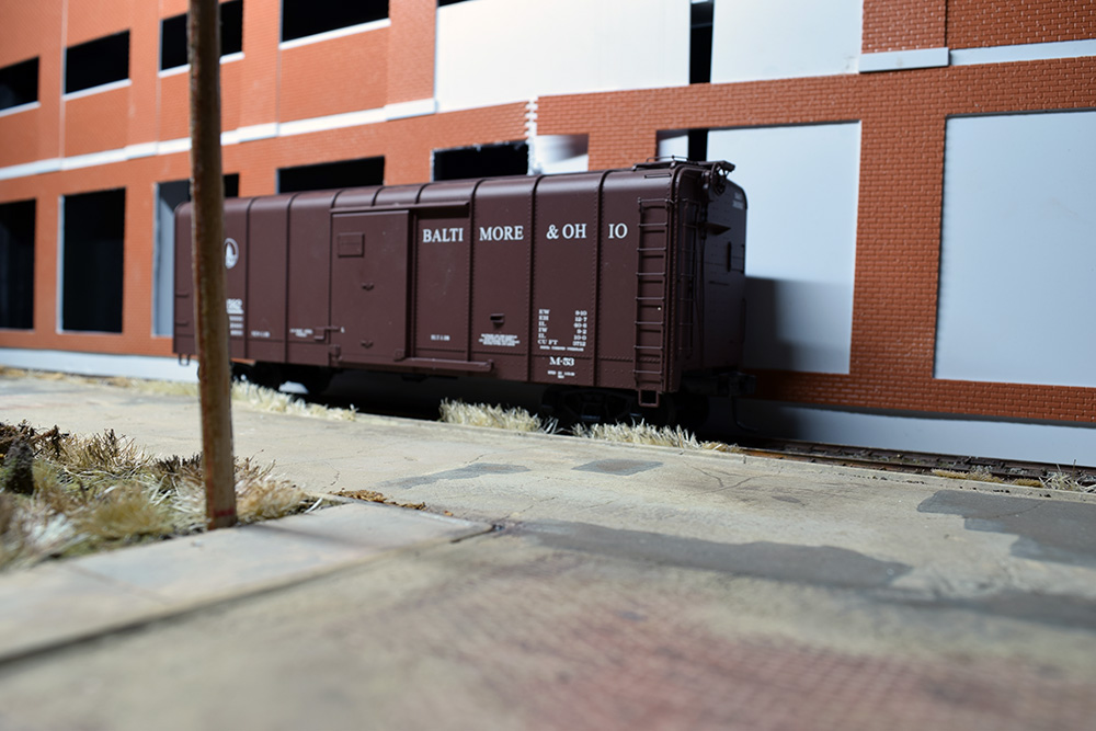
The streets act as leading lines that direct the eye in and out of the composition. Repeating an element like the bricks from the structures into the street surface gives a cohesive quality to the scene.
Finally, the vacant lot provides much needed contrast to the massive buildings and narrow alleyway by giving the eye a place to rest. However, it isn’t just empty space. While simple in form there is visual interest to explore in the dirt encrusted gravel and scattered vegetation. After looking around a bit the eye is rewarded with a pile of old lumber that creates leading lines to specific spots. These are deliberate photo compositions I built into the scene throughout the cameo.
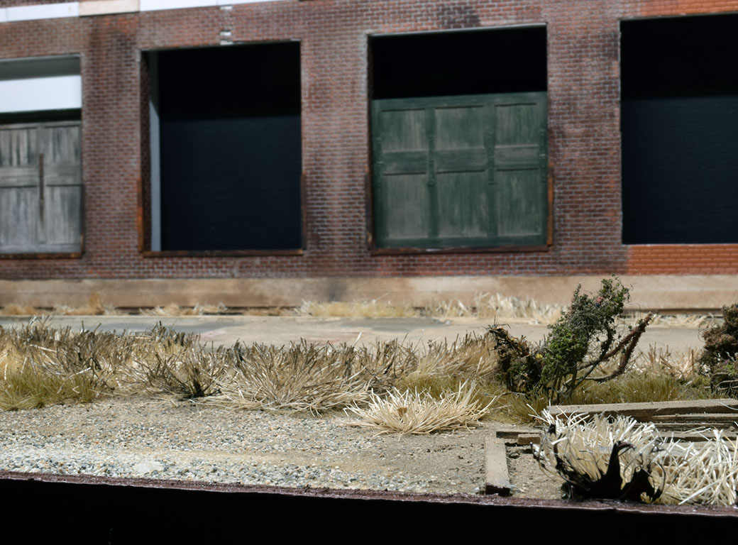
The basic principle of a leading line is illustrated here. From this spot as your eye travels along that single board, your gaze wants to go to the loading door in the background. I can strengthen the effect with one or two other pieces and/or heighten the contrast of the loading door with its neighbors. Details like this can be thoughtfully placed or scattered about randomly without any consideration.
Conclusion
A visual hierarchy is a guide for aesthetic choices that can enhance your modeling and is entirely compatible with our more familiar practices. It is another tool that helps people understand what our modeling is about. By learning some simple principles and choosing what to emphasize, we can guide a viewer without overwhelming him or her with a mass of confusing detail. However, don’t mistake these principles as an excuse for selectively eliminating details. Instead, use them to elevate your experience of modeling to a new level.
Regards,
Mike
0 Comments
Trackbacks/Pingbacks