Cameo Planning: Transitions
Transitions on a layout can be troublesome. Done well, the eye moves easily across a scene. Done poorly, they stick out like a sore thumb. There are several transitions to deal with on a layout: from one scene to another, from foreground to the backdrop and from onstage to off. In this post I’m discussing the transition from the foreground to the backdrop.
The transition from 3D scenery to the flat plane of the backdrop is tricky. Rather than the seamless panorama we hope to create, it can draw unwanted attention via the stark contrast in texture, perspective and color. We want to de-emphasize this area and ease the eye across it and there are simple ways to do this. Some of them are obvious, others not.
Color
Color is one of the least understood and under used tools we have as model makers, which is too bad because it’s a powerful and effective way to create the illusion of distance.
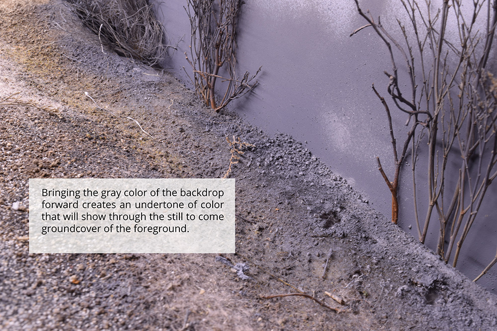
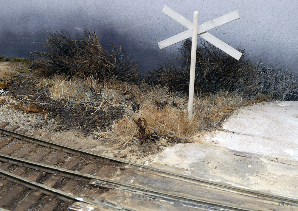
My backdrop is nothing more than a plain overcast sky with a band of gray color at the horizon that represents distant woodlands shrouded in mist. To the west of Mill Road the track is on a fill next to a small patch of woods. Typically, modelers would hide the backdrop transition with masses of foliage. However, I’m modeling winter when the leaves are down and sightlines are more open. To ease the transition from the 3D landforms, I brought the same gray from the backdrop forward onto the modeled scenery. This creates an undertone of color beneath the groundcover that will help carry the eye on to the backdrop. The success of this technique is in how the colors and textures blend from one to the other. The critical thing is to avoid a jarring visual contrast that says the 3D world stops here.

Color Temperature
Color has a temperature that can also be used to great advantage. Simplistically, we think of yellows, reds and oranges as hot with blues and greens suggesting coolness or even cold. Yet with every color there are warm and cool versions. Mixing blues and browns produces a range of useful grays with a warm or cool cast. Simply mixing black and white produces a dull lifeless gray that’s of little use for our purposes. Generally, mixing any two colors that are opposite each other on the color wheel (red and green for example) will produce a range of grays and muted tones that can be used to great effect in a model landscape.
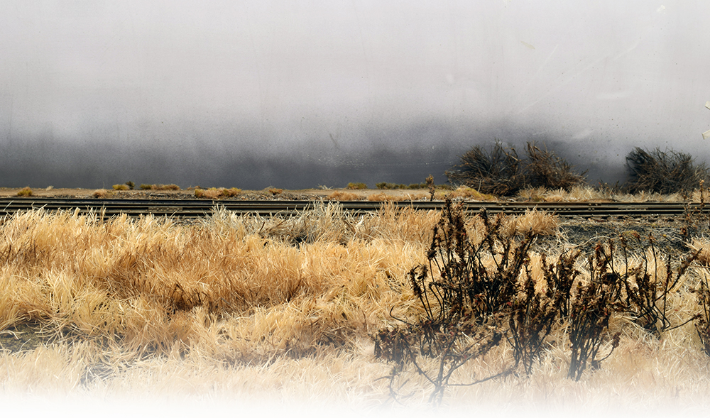
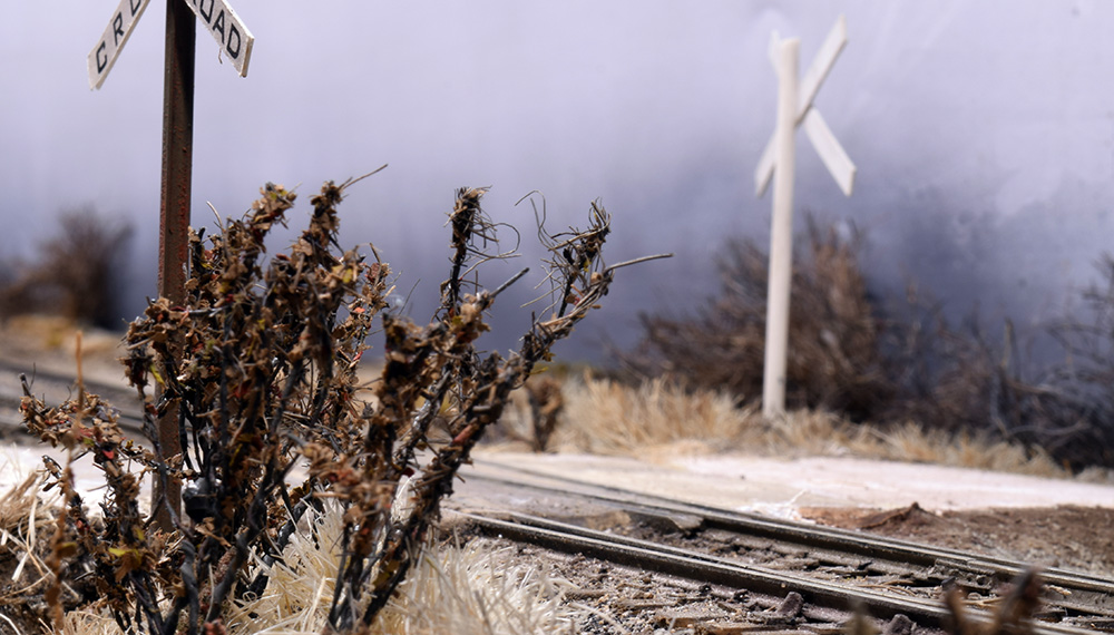
On the east side of Mill Road, the terrain is more open. To enhance the feeling of open space, I combined cool colors with forced perspective to the grasses and shrubs. Starting next to the tracks, the wild grasses are normal height and get progressively shorter as they approach the backdrop. To further enhance the visual impact and tone down the natural color of the sisal twine, I applied varying washes of light browns in front and gradually transitioned to cool grays at the rear. These cool muted colors recede visually, suggesting a greater distance that what is actually there. At the backdrop, I again brought the gray woodland color forward into the bushes and groundcovers. Using this color here carries the eye easily back through the lacy texture of the bushes to the muted band of distant trees on the backdrop. The cool grays not only help the background recede but give a strong feeling of cold and dreary weather conditions. Using color to suggest and enhance a mood is something we seldom do yet the potential is unlimited.

Using forced perspective and muting the colors of the wild grasses help create a greater sense of depth between the track and the backdrop.

Use Strong Colors With Care
It should go without saying that the landscape colors involved are muted in tone. Strong, bright, warm colors are overpowering and attract our attention easily. We can use this quality to lead the eye but do it sparingly and deliberately.
You want to avoid sharp contrasts at transition points, even if you’re representing a sunny day. The farther away an object gets the less saturated colors appear from looking through more and more layers of the atmosphere. Landscape artists and photographers understand this phenomenon very well and use it to full advantage in their work.
It’s Up To You
For anyone interested in taking scenery to a higher level, I encourage you to check out books on landscape painting techniques. The best of these will cover color theory, the impact of light and how the eye perceives color. Your local library or bookstore is a good place to start and I’m certain YouTube has loads of tutorials just waiting for you to watch.
I’d also investigate museum dioramas such as the ones at the American Museum of Natural History in New York City. This is landscape modeling of another level. There are several online resources to study and I found and purchased a used copy of the book Windows On Nature that takes an in-depth look at these dioramas. It’s proving to be an excellent and inspirational modeling resource.
I’ve only covered a tiny fraction of what we can do with color on a layout in this post. In depth coverage would require several books worth of material. To understand these techniques and applications, you have to learn to see them in the real world and that takes time and effort. I know you’re sick of hearing that but there’s no other way.
Regards,
Mike
References:
This post about the American Museum of Natural History wildlife dioramas gives a nice behind the scenes look at their construction.
Facebook Tutorial on Using Color
In a stark contrast to our practice, top tier military modelers manipulate the colors of a single vehicle to suggest the conditions and environment they want to represent. This Facebook Q&A tutorial from Michael Rinaldi is one of the finest discussions I’ve read on the subject. Everything in here is applicable to our work.
Thanks for sharing, Mike!
Mike, brilliant post on a really important topic. It’s really hard to think of many scenery articles talking to the effects of atmospheric perspective, cool versus warm and the oxidation of surfaces as tools to add depth. And you hit one of my favorite points by just painting your backdrop a formless, plausible gray! Why waste time putting in all sorts of detail only to have people critique your artistic and perspective skills? And if you must, keep it simple. Details in the background only draw the eye away from what’s important! Further, your technique of overlapping the backdrop color onto the foreground is quite simply brilliant. Let the brain fill in the missing information.
Backdrop joins really argue for using photography as a tool to distance us critically from our work. Take a picture. Does it look plausible? Really? Edges? Shadows? Seams? Mirror the picture. Now does it look plausible?
An aside on color temperature. In addition to meaning if a particular color is warm or cool, it also frequently refers to the color of the light coming from its source (sun = warm, incandescent bulbs = warm, unbalanced fluorescent = cool, etc). Depending on the light source, the color of an object will change. It could be muted or even look like another color. Everything placed on the layout needs to be painted under light matching that used on the layout.
Finally, a slight addition on mixing grays from complements of a brown/blue mix: this creates a muddy dark color that you need to add very small amounts of white into to get those grays. More white = lighter gray. Less white = darker gray.
Thank you but I won’t take credit for any of those ideas. They were inspired by people more skilled and a lot smarter than I am.
Mike