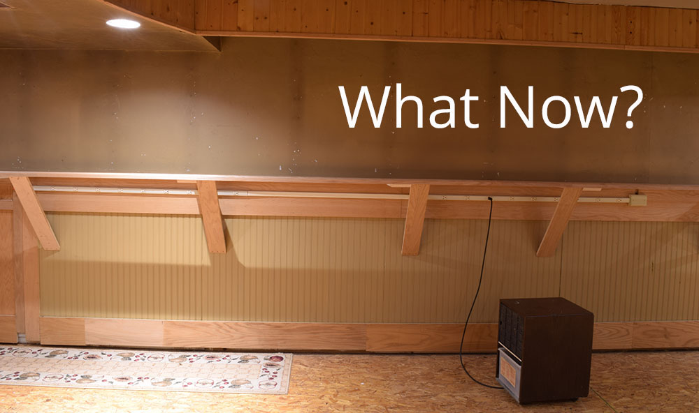
As you can see, I have a clean slate again. The Mill Road cameo is in temporary storage until I decide its fate and the other sections have been dismantled for the materials. Although I was and still am happy with Mill Road, I’ve taken it as far as it wants to go. It’s time to move on.
The shadow box concept is a step in a better direction for my purposes but it has downsides that I no longer want to deal with. As the scene developed, the bulk and weight of the module became too much. It was all I could do to move it singlehandedly, and the space required to store it is the same whether its’ in use or not. If I’m not going to use it, then I don’t need to devote space to it.
What Do You Actually Want?
What I want is a simpler, more flexible layout form that eliminates the chaos and destruction inherent in more typical methods.
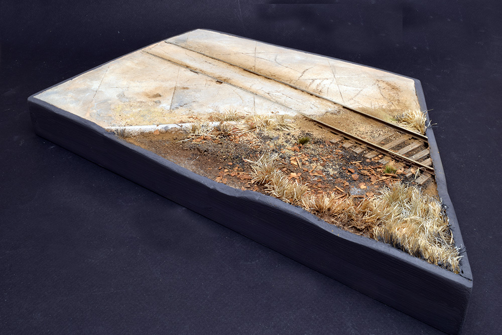
Throughout this series, I kept returning to this piece. I find it visually appealing in terms of the amount of detail I enjoy, coupled to the simplicity of it.

I see a series of larger forms that could be connected together and rearranged as desired. I also see the opportunity to feature a variety of distinct themes to satisfy changing tastes in modeling. In terms of a presentation format, I ‘m inspired by this video that Chris Mears shared with me several years ago.
The builder outlines his inspiration and reasons for his choices. Revisiting this video, in light of my current design interests I like what I see even more.
The Picture and The Frame
The dark colored support structure of this layout acts like the frame of a painting. The simple, dark and low backdrop, contains the eye without drawing attention away from the modeling. The supporting table does the same. Within this frame, the modeling is free to shine on its own.
Of interest to me is the way the modeling has been separated from the supporting benchwork. Traditional practice treats them as a monolithic unit, making changes to either more difficult than they need to be in my view. Treating them separately allows for greater design freedom while preserving the aspects that require the most time and care in making: namely the track and scenery. With this layout I especially like how the builder only focused on the essential elements of the scene rather than filling the entire space with scenery. This helps focus your attention where it needs to be. The reason this technique works is in the contrast it sets up. The detailed areas are balanced by the empty spaces surrounding them. These dark and featureless spaces offer nothing for the eye to focus on, therefore it is easily drawn to the brighter, more detailed and colorful modeling.
This presentation fits my design criteria of simplicity, creativity and craft nicely. It’s also reflects the low impact format I want. I imagine it fitting easily into a room space without dominating the area the way a traditional layout would.
The next step
I’ve painted the wall a dark color and the next step is to work out the design of what I want to model next. As I describe in the next post, that’s been easier said than done.
Regards,
Mike
0 Comments
Trackbacks/Pingbacks