I’m always amazed at how long I can stare at the obvious before I understand what I’m looking at.
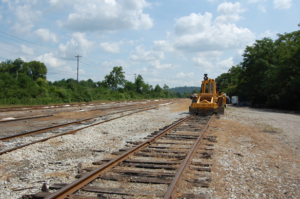
Every time I’ve come back to this photo, I’ve failed to see the lesson it has to offer. What lesson? Restraint. There is nothing to add or take away from the scene itself. It is what it is, a quite ordinary rail yard, simply and fully expressed in a manner anyone can grasp.
The volume of rail traffic will ebb and flow of course and the facility is a shadow of what was here in the past. A mere sixty years ago, J3a Hudsons screamed through here on crack passenger trains from Cincinnati to Indianapolis. Mohawks handled the freight to and fro and Mikados ambled along the branch. If you didn’t know that history, it would be hard to believe based on what you see today.
Typically, a scene like this doesn’t hold our attention for long. We’re conditioned to give a quick glance and mutter: “nothing of interest here.” This starts a downward spiral of thoughts that lead us nowhere. “Hmmm,” we say, “no buildings to model, the scenery is too plain, no operating potential. No thanks. I’ll pass.” Then off we go in that desperate search for the spectacular, the outlier, the amazing, the fantasy railroad with everything that only exists in our head. We conclude that reality, as pictured above, is far too boring.
However, a scene like this is within reach of anyone, which is why it’s so instructive. What’s important to understand is that when we allow ourselves to exercise restraint in what we model, our scenes will convey more power.
What if we stopped worrying about all the layout space we don’t have and saw the space we do have as an opportunity to create something wonderful? What if we truly understood the power of breathing room in a scene like this? What if we modeled the various elements in a way that allows them to be seen and appreciated for what they are, rather than scrunching everything down into a cartoon caricature? Wouldn’t such breadth in a simple scene make us pause, just for a moment, and look again?
I’ve visited this site many times and failed to grasp this lesson for exactly the reasons mentioned above. I still have parts of two dissonant layouts masquerading as one because I’ve been looking for that fantasy railroad of mine, rather than observing, studying and learning from the reality in front of me. With this knowledge in mind, I think I know (tentatively) what I need to do. As a friend says: “More to come.”
Regards,
Mike
Mike,
As I mature and become more knowledgeable in the craft of model railroading, I really understand what you’re talking about with regard to restraint.
In the past, I was caught up in the operations angle of model railroading where one often tries to cram in as much industry and track in a given space as is possible. It was fun for a while, but it really didn’t satisfy my need to use model railroading as an expression of art. I wanted to model railroad-oriented scenes that were believable and proportional to the real thing.
In my quest to accomplish this goal of realism, I still found myself trying to model more scenes than I realistically had time for. I, like you, model mostly a rural, agricultural scene. I planned to model three station scenes within 70 lineal feet of space. In retrospect, I probably should have stuck with modeling only one station in that amount of space. One station, with a large, open area around it, would be more likely to convey the feeling of spaciousness that I’m seeking to portray.
Ken Thompson
Ken,
If I’ve learned nothing else about quarter-inch scale, it’s this: it’s frightfully easy to overcrowd a layout. Everything in this scale takes up more space than you can imagine compared to HO or N. This is why the modeling often looks toy-like to my eyes, there’s just too much packed into too little space.
Like you, as I mature and refine my understanding of what I want, I keep going back to the layout and removing things, especially track, rather than look for ways to add something. This criteria isn’t for everyone but it’s working for me. I’m glad to know you’ve also found something of value from it.
Thanks for writing.
Mike
Looking at only the photo, it could have been taken anywhere here in Atlantic Canada. I think that universality in terms of the scene itself makes it instantly recognizable in others as it would me. In terms of introducing your vision, it’s nice to have those reference points perhaps already instilled in the viewer’s mind. With this referential small talk out of the way, maybe we could tell the viewer more a little sooner and draw them in a little closer. No matter what railroad or town you love you know a place like this at a time like this and it relates us. Did you take that just outside Truro, Nova Scotia? Wait a second, now that I look closer perhaps it was in Turkey? Maybe Indiana and a lot closer to where you live. Where doesn’t matter now as much. We’re always so hungry to immediately indoctrinate the viewer in our exact time and place that it starts to take precedence over the story that happens here and now.
There’s enough track in that picture to speak to a car capacity not reflected in the traffic levels today. Perhaps it’s traffic lost or maybe something more cyclic such as a seasonal traffic rush. Regardless, for me, the power here in terms of trains would be the appearance of the rail car and not the volume of cars since it asks the question of: “If the yard isn’t in use, why is this car using it?” That piece of maintenance equipment to the side calls to my own optimism. Hopefully there’s a future waiting here.
Stepping further back though, the white space in this scene is the detail. Editing elements from the scene only reinforces the message of the scene overall. It’s not something to be lamented but celebrated because we’re focusing the message to something more refined. I think that feels like exactly the evidence of good design we’re looking for.
Now, about that “more to come” statement. I’m curious.
/chris
Thanks Chris. As for your curiosity, all in due time! (Gee, how ambiguous can he be?)
Mike
Quality, not quantity: the hallmark of discernment.
Simon
Mike I too love the concept of less is more but I would like to point out what I consider a flaw in your thinking. In a response above you said;
“I keep going back to the layout and removing things, especially track, rather than look for ways to add something”
I think that removing things is adding something and if we think this in this term we will not be inhibited about taking that bold step and modelling less to accomplish more.
And to Ken, we are modelling one station in forty feet of layout in P-48 and three online industries which will be mostly flats which leaves enough air to give the sense of rural we are trying to convey, be bold, go back and move ahead!
So bravo Mike and pull out some more, really.
David
Hi David,
I agree with you assessment about adding by taking away, as you’ve seen in this week’s post. It’s a counter-intuitive thought isn’t it? How can you be adding something by taking something away? Empty space is something that few of us understand or appreciate. The power is in the contrast it provides to areas that are fuller with objects or details. Well said as always.
Regards,
Mike