“Now the bigger question, how to apply this in my own modeling.”
That’s the question Craig posed last week at the end of his comment. Whether he’s being rhetorical or not, it’s the central question many of us ask about the work we want to do. Without specifics, all I can offer here is general advice. Truth be told, I’m making a lot of this up as I go by trying a technique, looking at the results and adjusting as needed. If there’s any kind of formula at all, that’s it. Let’s get to Craig’s question though.
What Do You Want?
For using color in a scene, I need to know what result I want to achieve. Graying down the color near the backdrop, I wanted the impression of more depth and distance. As discussed last week, at each end of the scene, I want to draw your attention away from the area. Even though I might apply the same technique, the intent is different for each situation.
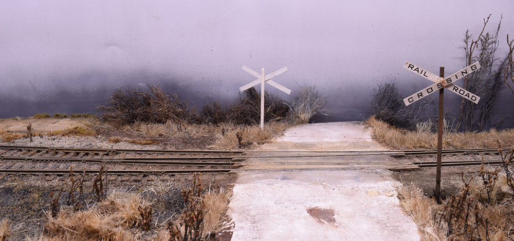
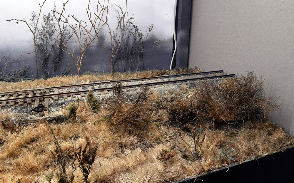
Viewpoints I don’t normally show in photos. Above you can see the ground cover gets grayer and less intense as it approaches the backdrop. As mentioned in the text, my intent here is to provide a sense of depth and ease the transition from 3D scenery to the flat plane of the sky.
In the second photo, I used the same dark color washes on the scenery and roadbed along with more opaque color on the rails. I don’t want the eye to linger near the edge of the cameo but to move left back into the scene.
To understand how color impacts both places, I’ve spent a lot of time outdoors just looking at the landscape. You could do the same thing with photos but understand the camera’s sensor or film will alter the colors, if the settings are off.
What Am I Supposed To See?
If this is completely new to you, you’re going to wonder what in hell am I supposed to see? The simple answer is, you want to see what’s actually there, instead of what you think is there. Huh?
We form preconceived ideas about things and events. These preconceptions may be accurate but most likely aren’t. For a simplistic example, up close, a brick looks red. At increasing distances, that brick gradually shifts color toward blue or gray because of way the moisture in the atmosphere refracts the light. We’ve already told ourselves that bricks are red, so when asked what color the brick warehouse in the distance is, we’ll say it’s red, instead of the blue or gray that our eyes see.
Beginning art students have to learn how to “see” an object as it actually is and one traditional method is to change the context of the object. As Dave suggested a few weeks ago, take a photo and look at it upside down or in reverse via a mirror. To see color accurately, take a piece of gray or black construction paper or cardboard and make a small hole in the middle of it. Hold it at arm’s length and look through the hole. You should be able to see the distant color more accurately because you’ve changed the context for your brain.
It takes time so don’t get discouraged if things don’t look different immediately. The mind is a powerful thing but you can make a habit of observation. When I’m outdoors, running errands or going anywhere, I’m always studying the landscape.
Be Consistent
Color looks more intense on a sunny day than it does under overcast clouds. Consider the type of light you’re trying to mimic and be consistent with it in choosing how to manipulate the colors of your scenery. On my cameo there are no bright colors at all. Something as mundane as a bright red or yellow road sign would draw the eye right to it. I want to emphasize again how this principle applies to everything. I picked up a Lehigh Valley boxcar kit recently. Straight from the box, the bright white color scheme would act as a beacon on the layout. I could repaint and letter it for a different road but I’ll weather this car to carefully match the atmospheric light so it can blend into the setting I’ve created. Because it’s so distinctive however, it likely won’t show up at the elevator too often.
Conclusion
I’ll close by saying that nothing on the cameo is final at this point. Since starting this series of posts I’ve gone back and redone areas that I’m not satisfied with. As the scenery develops, I’m always evaluating the overall impact and make adjustments as needed. Like a painting, it’s finished when there’s nothing left to add or take away.
Like the other skills of our craft, the ones I’ve discussed in recent weeks can be learned. Achieving subtlety and nuance comes with practice and time. Treating scenery like this brings a new sense of satisfaction to my modeling. The cost is minimal but the impact isn’t.
Mike
Mike,
I have a million questions for you but understand this is a blog and will keep my Q’s to a minimum.
Do you use a static grass applicator for any of your landscaping? And what is your background made of, is it the basement wall or do you have some type of styrene type background up etc?
I’ve been a reader of your blog for a couple years now and this particular subject comes along at the right time. I have my track down (HO🕺🚂💨💨) “don’t hate😉” and working flawlessly, now I need to set the tone and get the area right. I’m modeling the Pacific Northwest / Southern Pacific right before the UP took over. I want to get that dark wet gloomy look everyone thinks of when they think of Oregon. Your recent blogs have been like a challenge in a good way. At the same time it’s like I’m starting from scratch. I never had thought of modeling my scene like I remember it. Which was usually raining, cold, dark, typical Oregon weather. Any pointers and more advice on what you’re doing is appreciated.
Thanks
Patrick
Hi Patrick,
I do not use any static grass. What you see is lengths of ordinary sisal twine cut with side cutting pliers and glued in place. It’s laborious yes, but simple to do. It’s a task I can do on a moments notice for ten minutes or an hour. The back drop is simply a piece of aluminum flashing stock found at any big box home center.
As for the rest of your question, I think that will make an excellent blog post for next week. Feel free to ask questions here and I don’t care what scale anyone models in. If HO is the right choice for you, that’s all that matters.
Happy Thanksgiving.
Mike
Mike,
Starting new layout in upper Midwest. Like the darker winter look. Sky can be difficult, a lot of too blue sky on layouts. What color are you using?
Thanks
John
Believe it or not John, the sky is nothing more than a coat of white spray paint. I was going to take it further but haven’t yet. I’m not certain I will at this point.
Mike
This is some pretty interesting stuff, Mike. Those two photos in the post, and your final comment about the backdrop being white, illustrate perfectly how a single color can be perceived incorrectly. The first photo shows an almost pink/purple effect on my laptop screen, in the second photo it appears to be a cooler gray. Maybe the color balance of the camera, maybe the lighting situation, maybe my laptop, maybe a bit of how our brains fill in color based on adjacent colors.
It’s hard to tell what the real color is from the two photos, but I’d never have guessed white. Observation of the real thing with our eyes is the only way to get the right answer. I love your answer that you may do nothing further with it, that it may be effective enough as is. This, to me, is the hallmark of an artist, knowing how to create the viewing effect with the minimum effort, leaving out detail and letting the brain fill it in.
I learned to observe a color with my eyes, then mix it on the palette and then apply a dash to the canvas before committing to the color. Why? Because on the palette the color will look different than when put alongside other colors on the canvas. It is not unusual to need to remix the color to get the effect we’re after. An example of this is how the grass looks yellower in the lower photo: The gray highlights the warmth of the yellow.
The upshot: observation gives us the reality and understanding of how things look, the blueprint of what looks plausible, but in the model (or painting) we, as the craftsman/artist, may need to take some liberties with the color to get the effect we want for our viewers. This means at times making things a bit cooler or warmer, less saturated (strong) or more neutral (muddy or gray), or putting complementary colors next to each other to make one look stronger.
Hi Dave,
I think the camera settings and shooting angles play a large part in what you see. I keep the white balance setting the same and try to process each photo the same way in Photoshop. Even though the layout lights stay put, the angle I’m shooting from changes how the light hits the scene. In the last two photos the light is coming from behind the camera, so you’re seeing more of the true color. In some of the previous shots things are backlit more, which changes your perception of the color. It’s weird. As for the chameleon sky, there may be a color cast from the charcoal gray top panel. In person, it’s easy to tell the sky color.
You’re right about manipulating the colors. Indoor light is much weaker than natural light, so yes, we boost things here and there to compensate.
Regards,
Mike