
Design is a language; often a visual language that influences our thinking daily whether we realize it or not. Once you understand the basics of this language, you’ll begin to see the world differently.
Both art and modeling draw heavily from similar design principles and in this post I will outline one of them and how it applies to our work.
What Is Hierarchy and Why It Matters
Establishing hierarchy in a design brings a sense of order that helps us understand what’s important in the message being conveyed. Hierarchy is created using contrast, size, color and position to emphasize one object over another to direct the eye in a purposeful way.
In the graphic above, the word hierarchy is huge and likely the first thing that captured your full attention. The word interrupt is also bigger than the rest of the text but not nearly as big as the word hierarchy to suugest it’s secondary in importance. All of these changes in the size of the font were deliberate choices on my part to influence how you see the design.
In modeling we often copy a photo as closely as possible. The photo becomes a road map and whenwe’re done the scene may look accurate to the photo but feels off for reasons we may or may not understand. While the photo is two dimensional, in modeling we’re dealing in three dimensions. Without thoughtful consideration, even in a faithful copy the eye can be overwhelmed and not know where or what to look at first.
Establish A Hierarchy
Creating a freelanced scene is a different exercise. Here we may have just a vague idea of what we want. Rather than follow a predefined road map, we mash up a piece from here, and something else from over there and, again, visual chaos may result.
As the scene on Mill Road developed, the strong lines of the fascia and light valance produced an undeniable horizontal emphasis that spoke clearly of the Midwest landscape. However with nothing more than an expanse of grass, where do you begin in understanding the scene? It needs a center of interest beyond the trains. I need to create a visual road map to help viewers understand the story of the cameo.
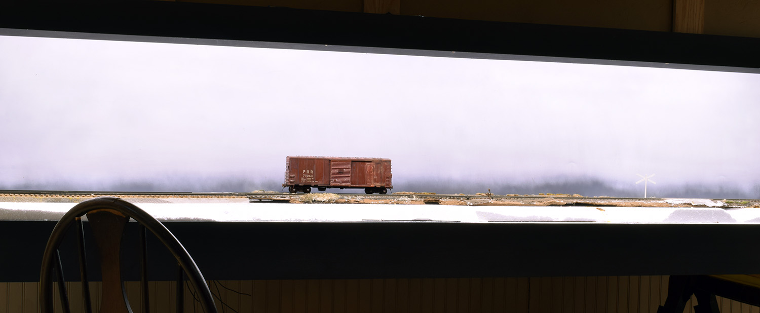
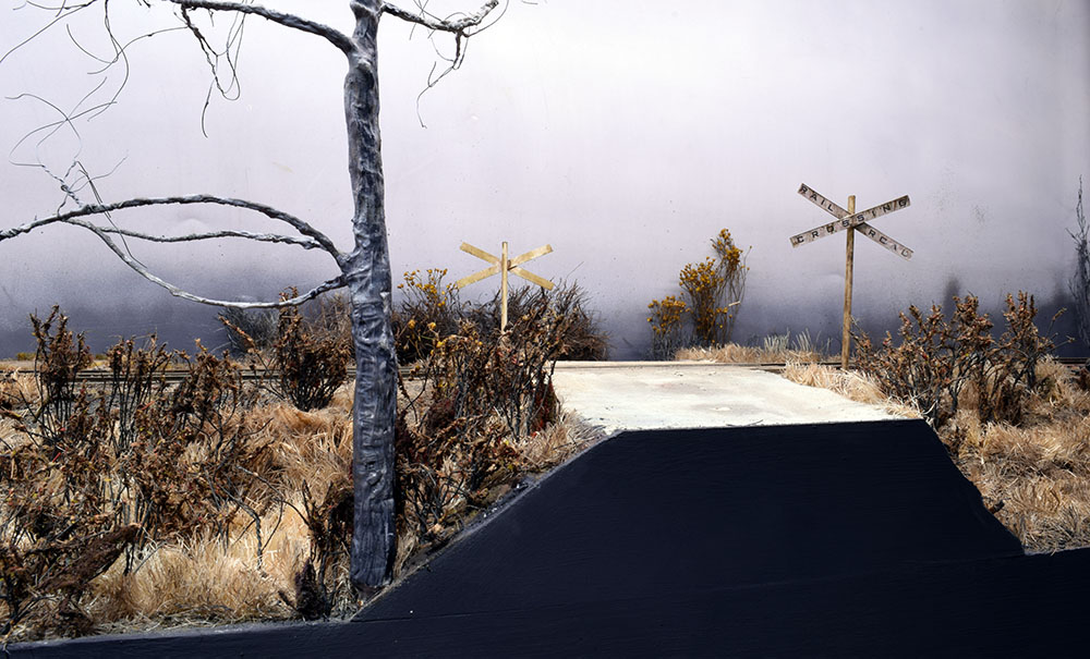
In this early view (top photo) the lines of the fascia panels create a distinct horizontal feel that mimics the Midwestern landscape of my area. As seen here, the track repeats these lines and encourages the viewer to sweep across the scene quickly.
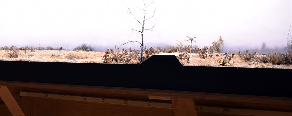
Here the foreground tree and road crossing give the eye a destination to explore. I deliberately left the train out to show how open the scene feels. In my view, this reflects how we often encounter the railroad in real life.
The basis of the scene is a remnant of track from the old layout featuring a grade crossing that, for obvious reasons, is a natural focal point. The opposing line of the roadway interrupts the track line that stretches from end to end while the cross bucks provide a vertical contrast to the relatively flat landforms. As the scenery developed further, I saw that I could strengthen these contrasts even more.
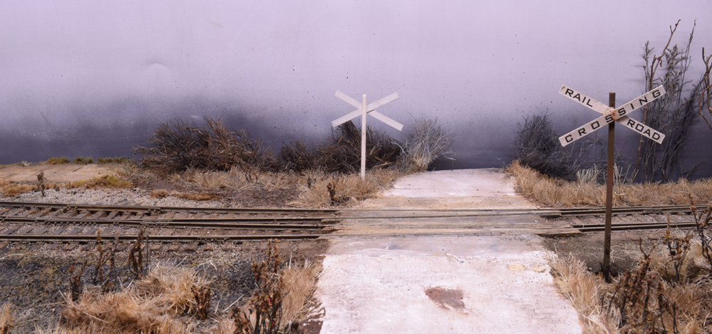
The opposing line of the roadway interrupts the strong horizontal flow of the track and surrounding landscape. It also leads the eye into the scene. The cross bucks provide vertical contrast to the overall flatness of the landforms. It’s a beginning but more can be done to strengthen this scene.
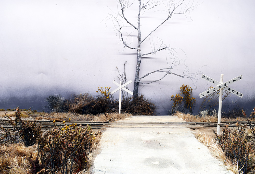
To begin, I modeled a specific sycamore tree, a species that is a personal favorite and common in the Midwest. This is the only tree on the layout and creates a strong vertical statement that commands your attention. Having studied this composition for months now, I firmly believe that adding more trees would only dilute the impact of it. Recently though, I decided to play with its location.
As you may remember from earlier posts, I originally placed the tree against the backdrop (image above) where, as you can imagine, the branches cast shadows on the sky. This is never ideal but I thought I would just live with it. The other day out of curiosity I moved the tree to the foreground and felt an immediate improvement in the overall composition of the area.
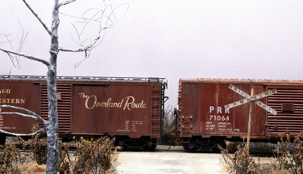
Moving the tree to the foreground creates a different form of hierarchy. It’s still the largest element and in this location its height enhances the sense of depth in what is a very shallow scene in reality. And yes folks, these photos reveal the ugliest sycamore tree and bark in modeling history. I assure you it’s a temporary stand-in.
Placing this tall form in front of the tracks does several things:
It strengthens the contrast.
In this spot the base of the trunk is below the track level, so the vertical line goes from the top of the fascia all the way to the bottom of the lighting valance. This strong vertical provides greater emphasis and a clear contrast to the relatively featureless landscape.
It creates a greater sense of depth.
The tree creates a clear visual break as the eye follows the track from one end of the cameo to the other. As you look at the photo above, the tree is obviously right here front and center, while the track is back there. This is hierarchy created by how the tree is placed. Bringing it physically closer increases its visual importance. Interrupting the view of the train reduces its impact and suggests it is farther away than it actually is. On a shallow 14-15-inch depth that’s a key factor in creating greater realism.
Ideas For Modeling With Hierarchy
As this scene creates a hierarchy for the entire layout, I could push things even more by creating a hierarchy within the scene itself. The tree is the primary focal point and I can strengthen the impact further by using slightly stronger or warmer colors on it while muting the color of everything else. You don’t have to go nuts with this; even a minor color shift will do the job of directing the eye where I want it to go as outlined in this post.
Given the persistent urge to overcrowd a layout, design principles like hierarchy help us see the composition as a whole instead of succumbing to the chaos of individual objects. Some things to consider are:
-Empty space can be your best friend. Think about what’s important in a scene, and then place the emphasis there, rather than add useless clutter that competes for attention.
How would I create a hierarchy without the tree? As mentioned the cross bucks provide a vertical contrast. I could play with their color by making it warmer to attract the eye or I could use a utility pole to provide the same emphasis the tree does. Consider that there are always multiple solutions for drawing attention or to distract the eye. In my view, the real power of Mill Road is the restraint used in the number of objects and amount of clutter. Other than the track and surrounding grass and scrub growth, there are few things to focus on which suggests more space.
-Don’t be afraid to play with color. The color of buildings, trees, soil, grasses and the like can be modified quite a lot and still look natural. Diorama modelers are a good source of inspiration for using color to emphasize and harmonize a scene.
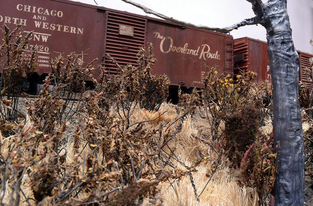
A significant hurdle with quarter-inch scale is how the trains tend to overwhelm the scenery. With the urge to stuff in so much track there isn’t room for anything else. Here the train seems in proportion with the rest of the scene.
-Relative size creates emphasis. Too often we subordinate everything to the trains. Trees and buildings look more like shrubs and sheds rather than the massive objects they actually are. A large tree or huge factory stands out because it is the biggest element. Don’t be afraid to use this to good advantage.
There’s An Art To Modeling
I understand that many people tune out when the topic of art and design pop up. I suggest through, that even if the terms are unfamiliar we all have a design sense that we go by. We know when an object is thoughtfully designed and well made. We can feel the vibe of a place and connect with it or not. We understand these things intuitively, even when we can’t explain why. It’s all part of what makes us human.
Regards,
Mike
Thanks for the informative post, Mike. I quite like how the road breaks up the shape of the fascia too. It’s interesting that you’ve put it so close to the middle of the scene rather than off to one side – rule of thirds and all that.
Hi Rene,
It depends on how I treat the scene as a whole. With the addition of the second module to the right, it does place the road closer to the center. With the single eight foot cameo, it’s well off center Thats a good observation for something I didn’t foresee initially.
Mike
Mike,
I enjoy your posts and the refreshing perspective they bring to modeling. The current post reminds me how important the concept of economy is to a scene and the need to focus the viewer’s attention. Thank you for the reminder of what’s really important.
Lee Gustafson
Thanks Lee. Glad it was useful for you. -Mike