Weathering Ties
A rivet counter rethinks old habits.
In chapter four of Detailing Track, I outlined a convoluted, throw whatever is on the paint shelf procedure for coloring and weathering the ties of my handlaid track.
The results were okay but I often went back again and again to modify the tie colors because I felt it was off or not what I wanted. Over time, I’ve become aware of how easily I slip into rote thinking and habitual patterns. With that awareness, I’ve deliberately rekindled my curiosity and searched for a process that is simpler and gives a color that is closer to what I see on full size track.
Pay Attention To The Light
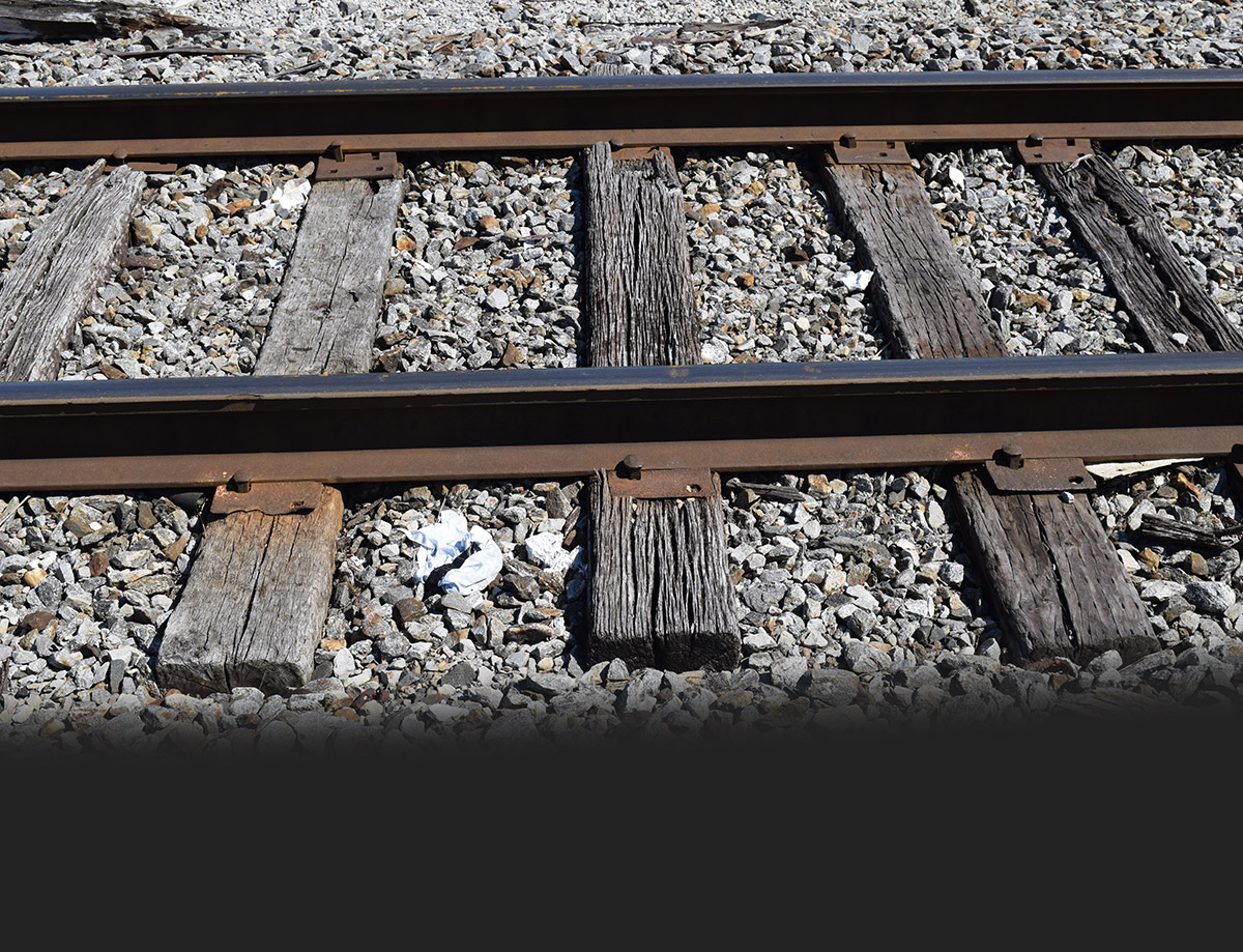
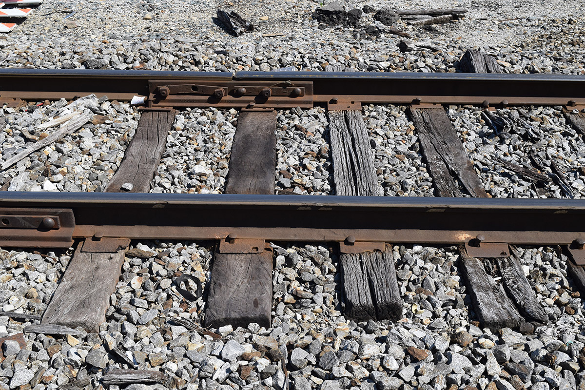
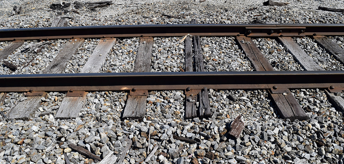
These two photos above are a good example of what I’m after. The first thing to consider is the quality of the light. I shot these images on June 14 between 10:30 and 11AM. Even before noon, the sun is almost directly overhead and with a cloudless sky, gives an intense light that strongly influences the colors seen here. The typically weak layout lighting most of us use isn’t remotely close to the intensity of sunlight and this will produce a profound color shift. When thinking about the model we need to compensate accordingly in choosing and mixing our colors to make up the difference in the lighting.
Wood Grain, What Wood Grain?
A second aspect I immediately noticed is the absence of visible wood grain in many of the ties shown here. These are older ties and one or two feature a pronounced open grain effect but it’s missing from the majority of them. However, the large shrinkage checks are obvious.
Having visible wood grain is another example of habitual thinking. I use a razor saw to impart the effect, dragging the saw blade lengthwise across every tie until I can clearly see the graining. After that I go back and rough up random ties even more, some to the point of the extreme. It works and I’m happy with the outcome but, as I look with more experienced eyes and judgment, I see I often miss the mark. Going forward, I’m inclined to go lightly with wood grain on a majority of the ties and reserve the stronger treatments as an accent. Again, the character and purpose of the track you’re modeling is the final authority for any effects you apply.
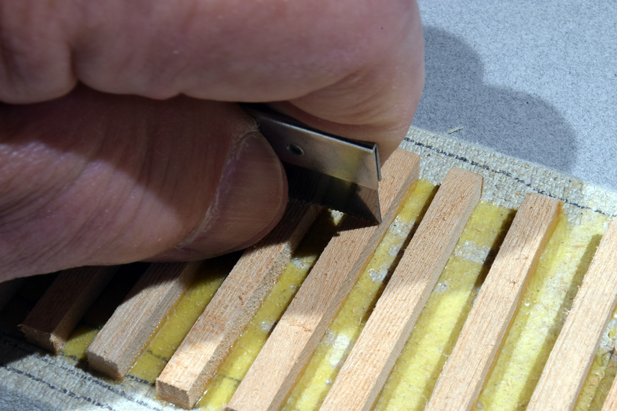
In the past I went too far with grain effects on my ties. Today I’m more reserved and use a lighter touch. In HO or N scales I wouldn’t bother with this step as it would be too small to see and not worth the effort in my opinion.
Color Me…?
With greater insights into the physical texture of ties we’re left again to consider the color. In the previous photos you see a range of browns and grays with subtle variations in each. Many of these ties are likely a half century or older in age, having had little in the way of maintenance over that time. The range of color variations between them is telling.
My original use of Minwax Golden Oak wood stain set the odds firmly against me, as the color is wrong from the start. This strong base tone comes through the washes I applied over it, shifting everything toward yellow instead of the grays and browns seen here. For my recent track modeling, I’ve eliminated this wood stain in favor of more direct methods.
In a post from a few years ago (linked below), I described using thin washes of acrylic craft paints directly on the raw basswood. I liked the results and wanted to experiment further with the technique to see if I could improve on it.
For the test section seen below, I used washes of Tamiya model paints instead. Geared toward military and aircraft modelers, this line of paint comes with a range of browns, grays and neutral colors that are useful for our purposes. Both types of paint give good results, so it’s a matter of personal preference. I followed the basic procedure from the earlier post by wetting the tie with thinner first (denatured alcohol in this case) and then floating on color washes. I also applied washes to the dry wood and saturated the surface with thinner afterward. Both methods are effective. However, the key to success in my view, is in the choice of the colors and learning to compensate for the color shift created by indoor lighting.
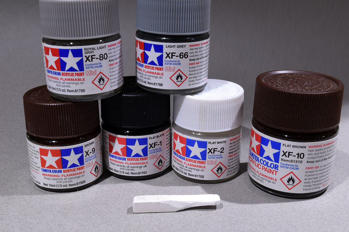
The basic palette of colors I used on the latest test section. These certainly aren’t the only choices however, I chose these for their closeness to the colors in my reference photos. The white pastel was applied as a dry powder that I worked into the surface with a brush and also rubbed directly onto select ties. It provides a flat finish and the final coloring.
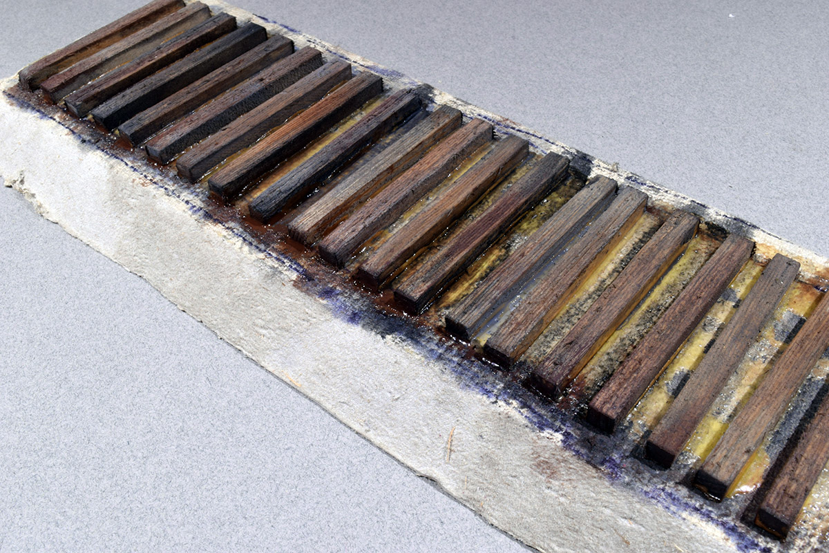
First Attempt
I started with washes of XF-80 Royal Light Gray as a base layer. To my eyes and under the 4000K LED lights I use on the cameo and workbench, this is a good beginning for the tone of sun bleached wood but hardly suitable on its own. I didn’t apply this to every tie, as I wanted to experiment with a range of brown and gray colors. On other ties I started with very dilute washes of XF-10 Flat Brown or XF-9 Brown. These have a reddish tint that helps warm up any color washes applied over them. As a base layer, they can be modified to produce a wide range of brown tones.
For the darker ties I used very dilute washes of XF-1 Flat Black, building up the intensity of this strong color slowly with multiple layers. I quickly discovered that a little Flat Black goes a long way and the results are too dark for my taste under the lighting I use. After it dried, I went back with lighter washes to reduce the intensity.
Since this is an experiment on a small test section, there was little to lose, so I felt free to play around and try different things. With regard to the process, I find I prefer to soak a tie with thinner and let a thin wash diffuse into the wood on its own. Like working with wet-in-wet watercolor, this produced some interesting effects and subtle transitions. You can control the technique to a degree by learning to judge how wet the surface is and how thick or thin the color wash is. It’s a matter of practice and judgment. Knowing when to quit is also useful.
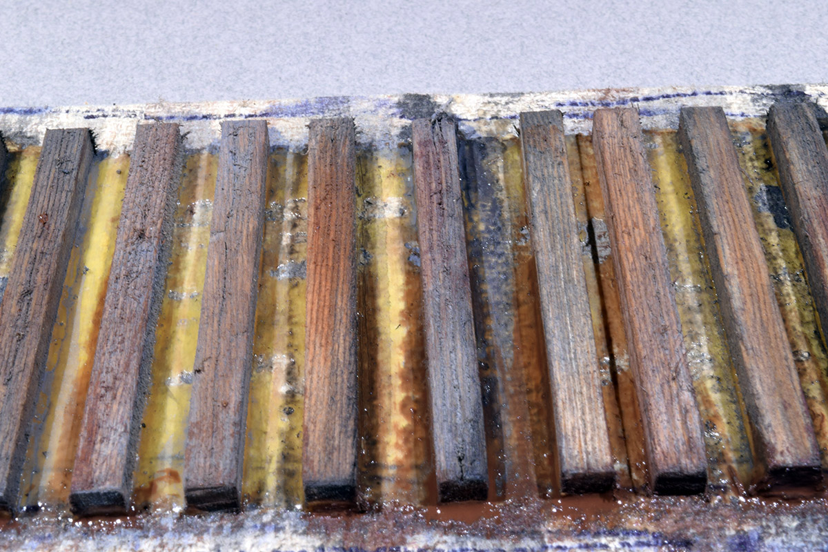
Second Attempt: Fixing Mistakes.
I let the sample dry over night and felt pleased initially. There is nothing really wrong with the color however, looking at it the next day I felt it was too dark overall, and lacked the bleached gray appearance I was going for. I decided to keep tinkering and see what happened.
In painting I’ve learned to avoid pure white as it sticks out like a sore thumb. However as a color modifier it’s a painter’s friend. I threw my self inflicted bias away and applied washes of XF-2 Flat White over the darker ties. Again, I flooded the wood with denatured alcohol and used diluted washes to build up the color and tone. I could see the bleached color effect I wanted coming to life and felt pleased with the difference it made. The final color isn’t opaque but has a hazy transparency that hints at other tones below. I’m calling it progress and know that a good outcome is achievable.
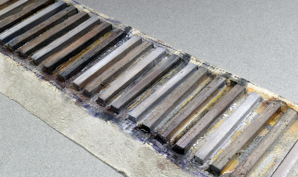
The takeaway here is don’t be afraid to push color to the edge. I could go lighter I think but, will stop here.
I hope this post is helpful. I know I’ve covered this topic before and will do so again. It’s always good to stay curious and challenge the assumptions behind earlier work. It’s also important to understand that there is always something new to learn and that your tastes will change with time. You won’t see things the same as you once did and, that’s often a good thing.
Regards,
Mike
Although I weather my ties a bit different, this has given me some wonderful ideas. Fantastic work and thank you for sharing Mike!
That’s exactly the point to remember Shawn. There is no single product or process to modeling track. We all see it differently and emphasize what draws us to it. Thanks for commenting!
Mike
I have used enamel paints in the past with success, thinned down to 5%-10% paint with own-brand thinners.
Best results I obtained was with Humbrol Metalcote “gunmetal”. Thinned down, the colour was about right for sun-bleached creosoted timber, and the metallic particles added a subtle sheen. This is then the base coat for subsequent washes.
Although they are slow drying, I like enamel paints as they force me to step back and wait.
I have been struck by the theme that seems to have emerged in your recent posts. You have shifted from detailed examination of the hopper car to a very focused look at track and now experiments in how to better reflect the reality you observe and want to recreate. You also shared some reservations about continuing this blog.
I hope you continue the blog and post as the spirit moves you. As to the recent focus on track, I am reminded of a portion of Lance Mindheim’s book about Model Railroading as Art. One of his points in the book was that constant observation of the subject is essential for an experienced artist as much as it is for the beginner.
I find your observations both about topics, like track, and model making in general, help to be not only a better observer but a better modeler through sharing your thoughts, experiments, and projects on this blog. I hope you continue to share your views with those of us who rarely communicate our reaction to the gift you bestow upon us.
Hi Larry,
Thanks for the kind words. They are truly appreciated. Yes, the blog will continue.
Regards,
Mike
Always enjoy this topic of tie coloring and weathering. I think Shawn showed images of another feature in the FB group. That is of the variation of color within a single tie. And it’s visible in Mike’s prototype images above. One end may have more gray coloring with brownish blackish tones between the rails, then the other end is again totally different.
That’s an excellent observation Gregg. Thanks for sharing it.
Mike