
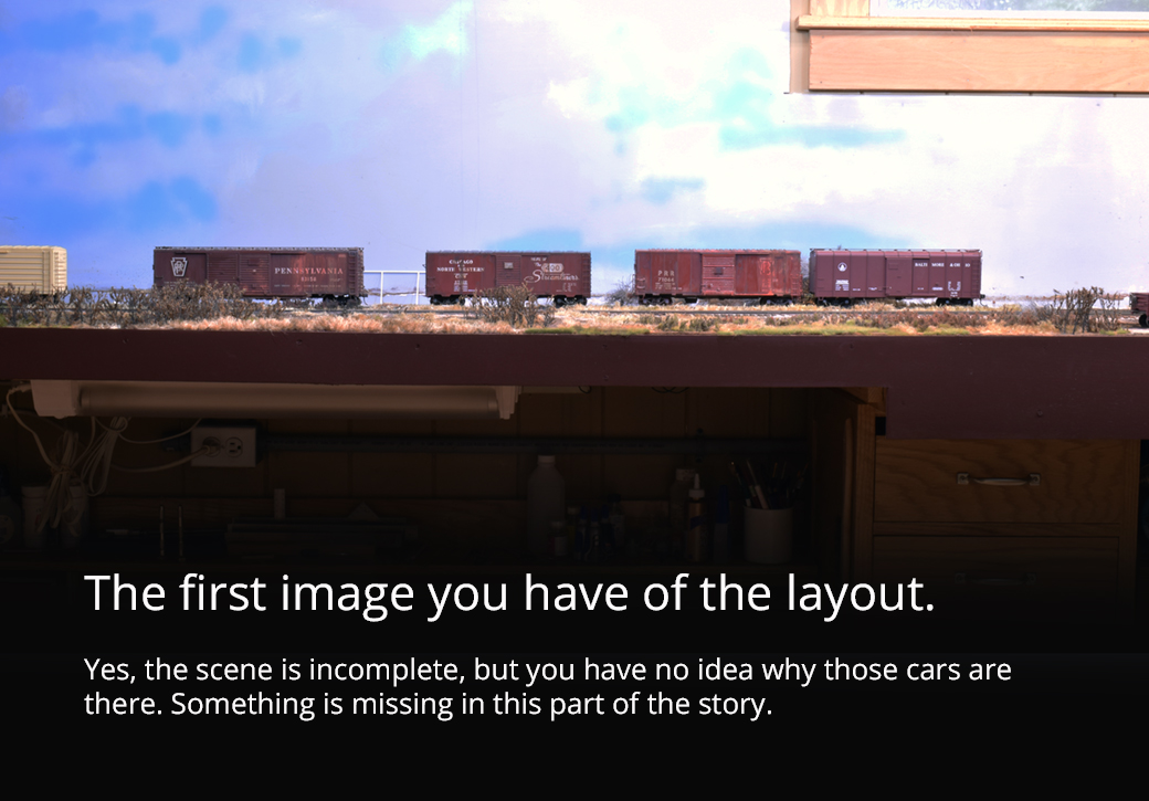
Why Are Those Cars There?
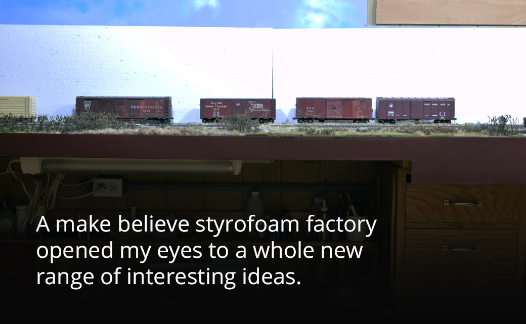
The journey of the layout back to the 1960s began with a sheet of Styrofoam. My work on the P48 display warehouse got me curious to see how it would look on the layout. So I placed a piece of foam that was similar in size behind the interchange track, stepped back for a look and realized it was a done deal.
Long suffering readers will recall the numerous posts about the section of layout above my workbench (photos above and below). I have revamped this portion at least three times, convinced I had found the perfect solution each time, only to grow dissatisfied again. This is the first scene you see upon entering the layout space and I felt it always made a poor first impression. I was discouraged and contemplated drastic measures that involved various tools of destruction.
Due to the workbench underneath, the layout has to be of a certain depth. I like things to have nice clean lines and the layout maintains that depth throughout, which isn’t the problem. The scene itself is the problem because it never really came together in a cohesive way. Placing the sheet of foam board changed my perspective completely. Let me explain.
The last two HO layouts I built sold me on the virtue of narrow scenes. Both of those layouts were only sixteen inches wide at most, which allowed plenty of room for the features I wanted. Moving up to quarter-inch scale, I returned to the standard 24-inch depth that was dictated by the workbench but also because the larger scale required more depth. At least that was my assumption. After ten years of working with the scale, I no longer believe this.
My work with the display module demonstrates to me beyond all doubt how little depth is actually required to convincingly model the scenes and operations I enjoy the most. As I explained in this post, the warehouse is the scenic context for the module.
Placing the foam board with similar dimensions on the layout changed the entire visual dynamic of the troublesome scene. Because of the large size of the sheet, it was like bringing the backdrop forward by six inches, without having to actually move it. I was amazed at how the shallower depth focused the scene and at how immersive it felt as a viewer to actually look up at the top of a building! In addition, I immediately saw that I could instantly add ten car spots by virtue of the warehouse loading doors. Without adding an inch, the existing track gained a significant amount of operational value.*
The Strength Of Quarter-Inch Scale
When you work in one modeling scale for many years, you become used to its size and to what you can and can’t do in a given space. This is fine if you stay in that scale, however, moving to a different modeling scale requires a period of adjustment as you learn the strengths and weaknesses of the new scale.
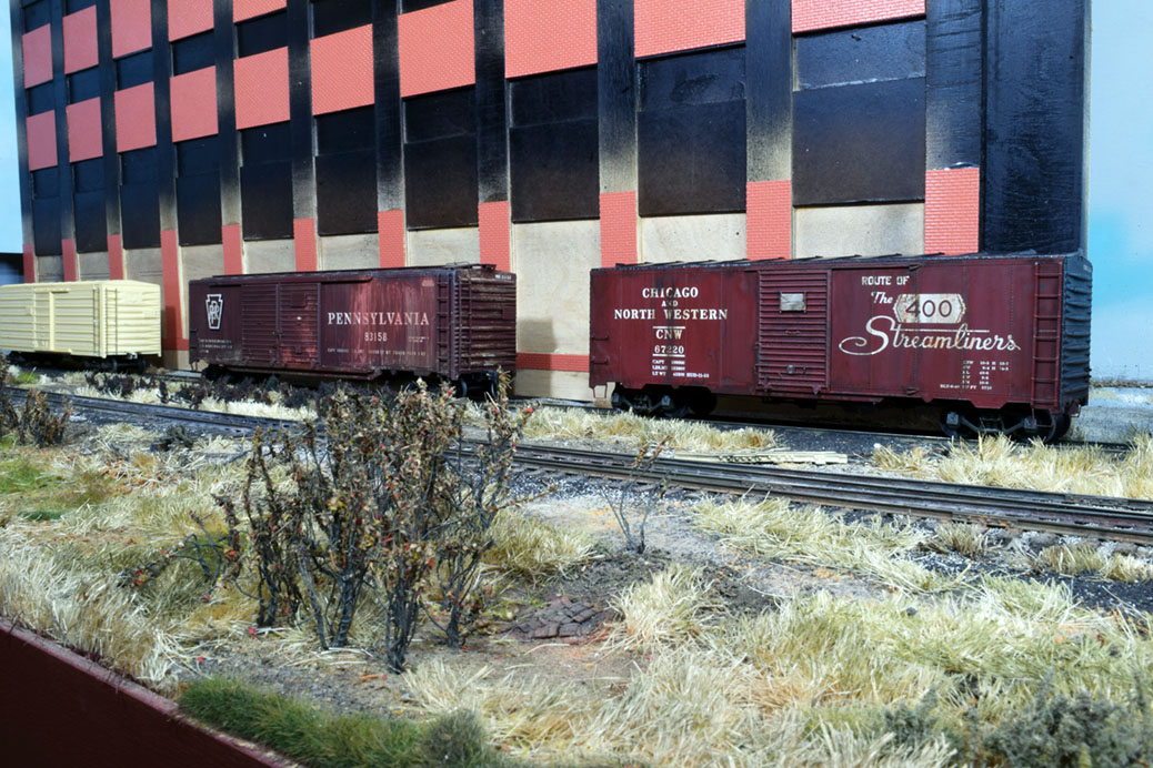
In my view, the greatest strength of quarter-inch scale is in the way you can immerse yourself in a scene (last photo above). The elements are large enough to have a genuine presence, especially if you choose your subjects carefully. Rather than fight the scale by treating it like an HO design, I’ve learned to embrace its alleged limitations by turning them into design strengths.
For example, the curve radii required for mainline operations in this scale often shocks modelers used to 30-inch radius HO curves. (A 60-inch radius is a good starting point for most steam wheel arrangements and things look more natural when you get up in the ten to twelve-foot radius range.) Rather than fight the space eating nature of such curves, I simply eliminated the need for any curves on my layout. By not fighting the design battle involved in turning a room corner, I was able to clearly focus on what I could realistically and easily fit in my space. Admittedly, such draconian choices won’t work for everyone but I clearly understood my objectives and making that choice was the right call for me.
As I studied the possibilities of adding the factory, I realized it provided the solution to several other nagging issues I was struggling with. Next time, I’ll cover how this single change has brought a greater unity to the entire layout and how the beginning is now the end.
Regards,
Mike
*Obviously I still have some pieces of brick sheet to add and I need to adjust the height of the flat so it matches the box car floors. It was placed for photo purposes only at this time.
Oh, wow.
You added purpose to the layout, and it came alive.
So simple and so effective.
Sion
As Simon says… “Oh, wow”. I’ll add an exclamation mark. “Oh, wow!”
The factory makes a huge difference and will definitely catch the eye and draw in the visitor. I’m looking forward to following your progress as you develop this scene.
It also occurs to me that an enclosed walkway over the tracks at the left end of the scene would help frame it. It’s a well-used device in the hobby, but sometimes those devices are well-used because they work. It might be worth mocking up such a walkway to see what it does to the scene. The large brick buildings on the cover of Model Railway Journal #245 come to mind…
– Trevor (Port Rowan in 1:64)
Simon and Trevor,
Thanks for the comments. It’s true, the warehouse gives a tangible image of what a railroad does. As I’ll share next week, there is a nearby prototype location I’m basing the layout revisions on. The flat effectively reduces the depth of the scene to 18 inches from 24, giving it a more intimate feel. You have a real sense that you are surrounded by a large building, since you can’t take it all in when standing next to the fascia and, it certainly does catch the eye when you approach the layout. I’ll have an update on the flat and P48 display in the near future.
Mike
This is a time when we can’t add enough emphasis and here’s my contribution:
“Wow!!”
I’m really impressed with how this change frames the scene.
I also like the question. We the builders and designers know why each element of the scene is there but it works with the idea of providing some direction to the viewer to help guide them through the experience instead of relying on telling the viewer and hoping they get the queues right. Further it provides enough visual clues to encourage the viewer to start to imagine their own stories to further enrich their experience as they take in your work. Answering this question provides the viewer with their own opportunity to build a relationship with the model beyond the one we have be working with.
This is indeed an opportunity to showcase the visual mass of 1/48 scale models and the way they encourage you to look underneath the cars and upward to try and see how tall that building is. It is an experience much more like being trackside than we can achieve in the smaller scales.
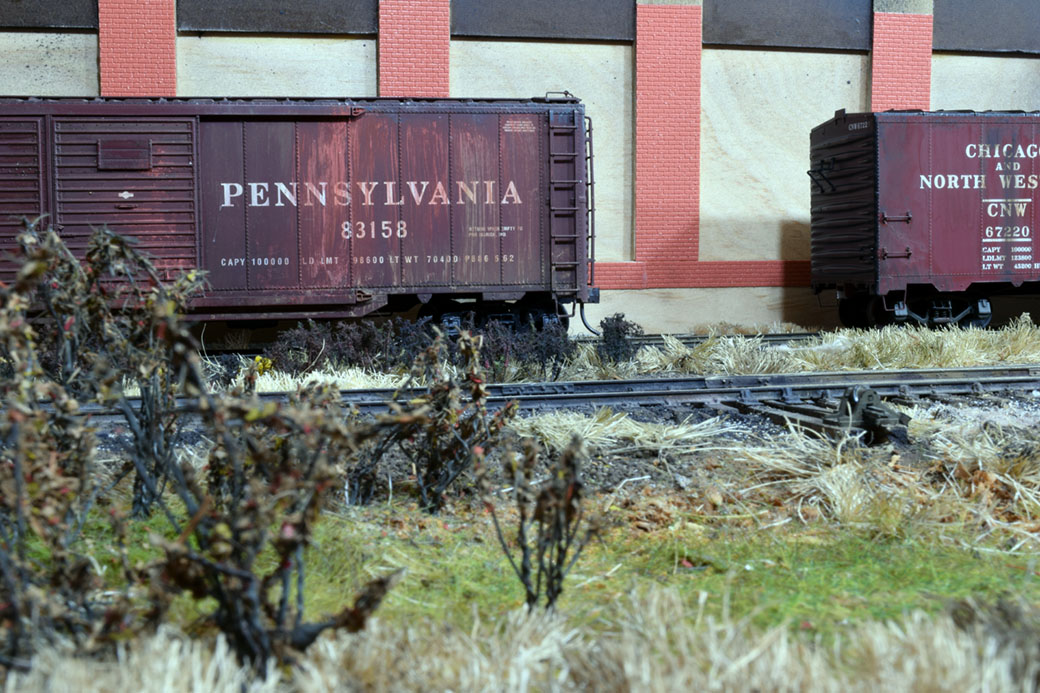
We often remark on how working in the larger scales makes adding detail easier. Placing those superdetailed elements in such a cleanly defined space really showcases that work by forcing the viewer to see the scene in a controlled manner.
I like so much about this and where the composition is going.
Well done.
/chris
(PS: I saw your note on the depth of the scene and recall a previous comment about the length of the scene. This layout, in a rather large scale, is making a very convincing argument to using a space we’d normally associate with smaller scale modeling. That’s worth noting – how well this space suits the larger scale model.)
Chris,
Yes, the size of this building is going to make a statement.
Mike