What Does Track Look Like?
Beyond the obvious two rails and crossties, what does track look like? Most of us think we know but do we?
Historically, our literature has focused on the mechanics of laying track aimed at the worthy goal of reducing, if not eliminating derailments. Stuff like getting smooth curves, keeping it straight and so on. It’s sound and excellent advice but for the most part, the mechanics of producing smooth track is pretty simple stuff. The thing is, you can have mechanically flawless track that doesn’t look anything like the real thing.
Modeling the visual aspects of track has received less coverage but there have been some excellent articles in the past, such as my two favorites from the late 1960s by Paul Larson in RMC. Sadly though, Paul’s writing was the exception. Most of the advice offered in these articles is pretty basic, like painting everything brown and grimy black with touches of muddy color here and there. This doesn’t cut it in a contemporary modeling culture that can recite the differences between boxcar end panels or modern diesel production phases.
Since moving to quarter-inch scale, I’ve enjoyed modeling track more than ever, yet I always feel there is room for improvement in my work. This isn’t some silly quest for perfection, I simply feel I could look more closely and increase my understanding full-size track.
An area where I feel the weakest is in rendering the color of weathered wood on ties. I outlined an extensive process in Detailing Track that was more of a hope and prayer than repeatable process. It produced acceptable results but left me thinking there was a better way. Recently on the blog, I shared further experiments with acrylic washes for the siding on the 13th and North E project. The washes produced better results and are more easily controlled than my previous attempts, yet I still think I could do better.
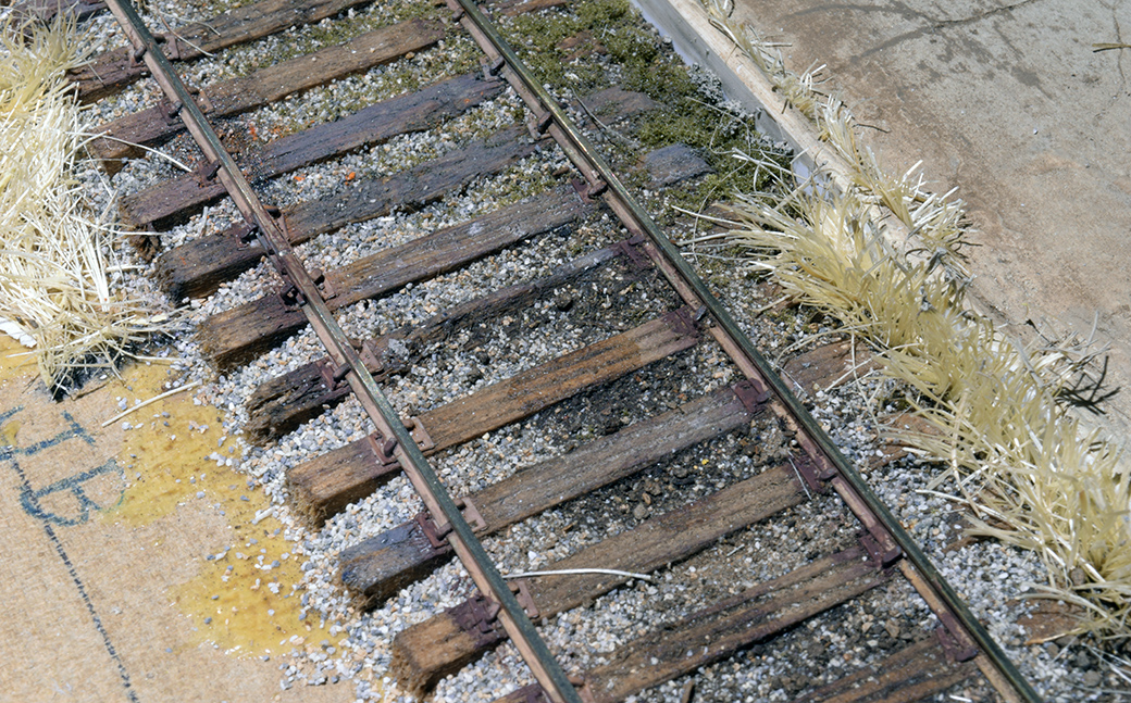
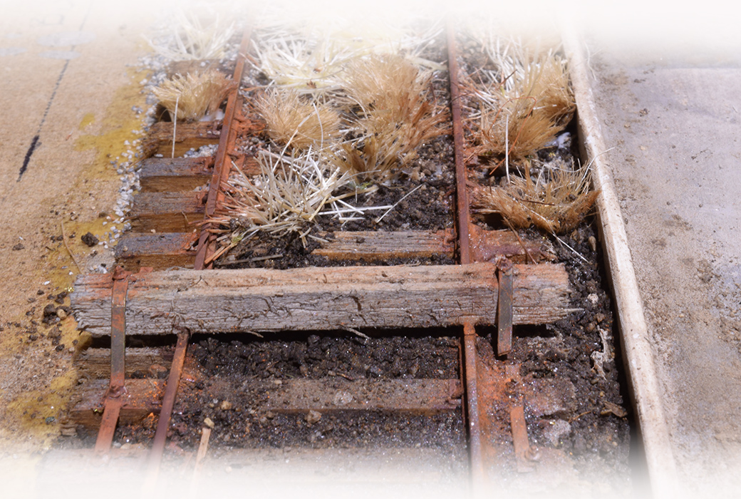
Different track with different purposes. I modeled a forgotten siding, while the mainline track below shows a far different character. There is plenty of room for improvement with my efforts.

A problem with rendering color is the conditions we have to face. Because indoor light is far less intense than natural sunlight, we have to compensate for that difference. The color temperature is also vastly different between indoors and out, making the task harder still. When we look at full-size track in bright sunlight, the color(s) we see under that light are different than the color we see under typical layout lighting conditions. As a result, we adjust the hue and saturation on our models as best we can and live with it.
I don’t have any secret formulas or magic techniques to offer. It’s a matter of practice and experimentation, with the understanding that the end result will remain a moving target. This is why I’m always looking for ways to push myself and improve. One of those ways is to always return to the original source of inspiration.
I understand the mechanics of track, yet I have never felt I understood it visually. In a portrait of a person there are nuances that are unique to the individual. Track also has qualities and nuances that tie it to a time and place and I believe these can be modeled once we realize what they are. Taking my modeling further like this keeps it fresh and challenging for me, otherwise I get bored and it shows in the work.
Do we really know what track looks like? Yes and no. Can we learn? Absolutely.
Regards,
Mike
0 Comments