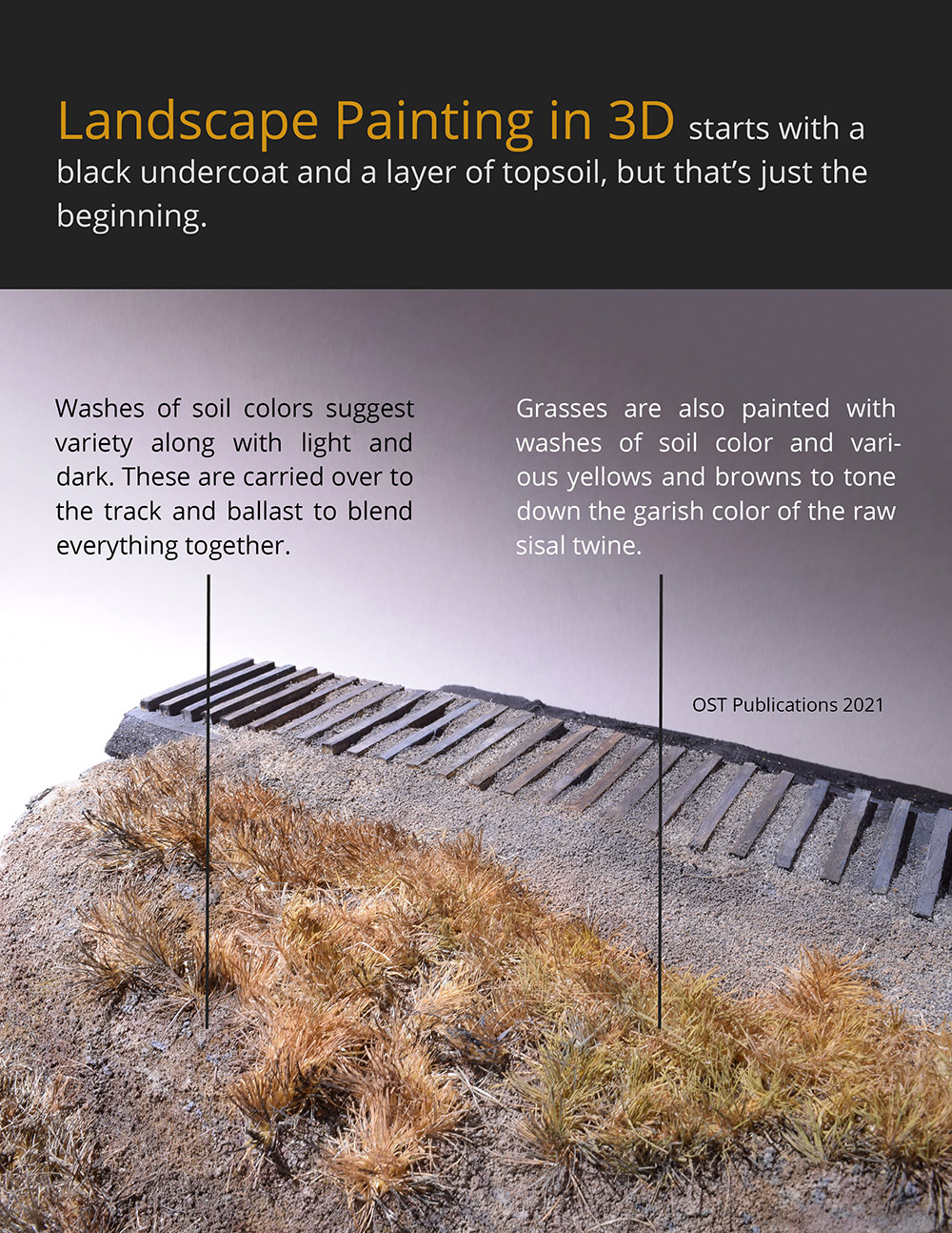
I’ve added basic scenery to my foam bench work test piece. It’s nothing fancy just a layer of plaster cloth, followed by a coating of sifted dirt and clumps of sisal twine for grass. It’s my typical way of doing scenery. Where I shifted gears is in the decision to experiment with diorama coloring techniques.
A hallmark of diorama modeling for me is the way the colors of the various elements relate to each other. There’s a cohesive blending of color that ties everything together. Diorama modelers are purposeful in the way they handle tones, highlights and shading and I find these techniques compelling.
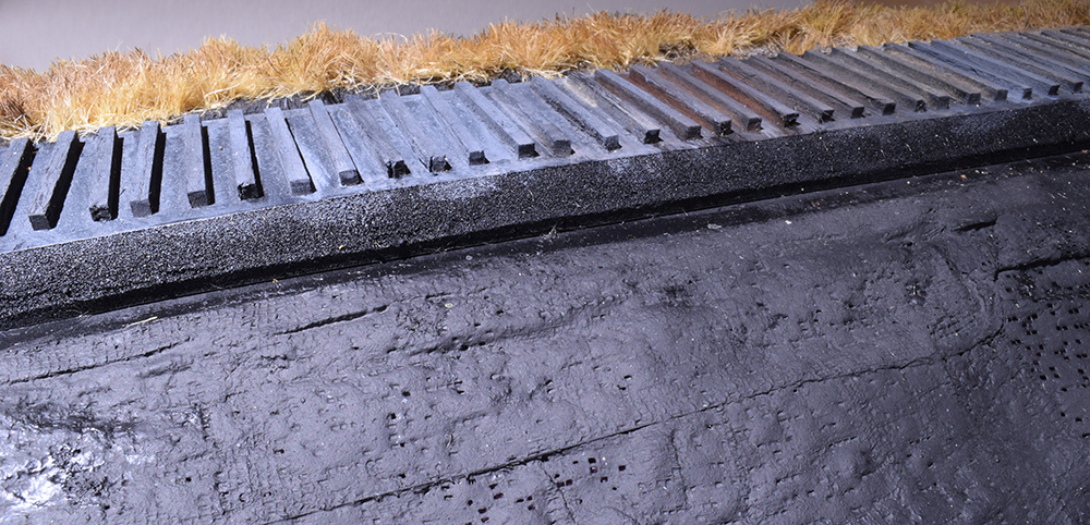
The first step was to give the raw plaster cloth some color. In the past I would brush on a coat of raw umber acrylic craft paint, and that would also work well here. Diorama modelers use flat black to provide a base layer for shadows, often times spraying everything in the landscape black. For this trial run, I confined it to the plaster cloth only using a spray can because it’s simpler than fussing with the airbrush.
Once the paint dried, I added ordinary dirt from my flowerbed that I sterilized in a low temperature oven and sifted for size. This was bonded in place as usual.
After the dirt was dry, I added clumps of tall grasses, and then took time to evaluate the progress. This is where many people would call the work done. Even though the basics are there, the scene has a patchwork quilt look about it where none of the elements related to the others. The color of the dirt could serve as is but the grass leaves something to be desired.


At this point, the terrain looks better but the fresh ballast seemed garish. I toned it down with similar color washes but had to use more opaque mixtures because the thin washes just disappeared into the granular texture. Use care with thicker tones or you’ll end up with painted ballast instead of stained. The ties started to blend in visually with the ballast but I know I can bring them back with more color if needed.
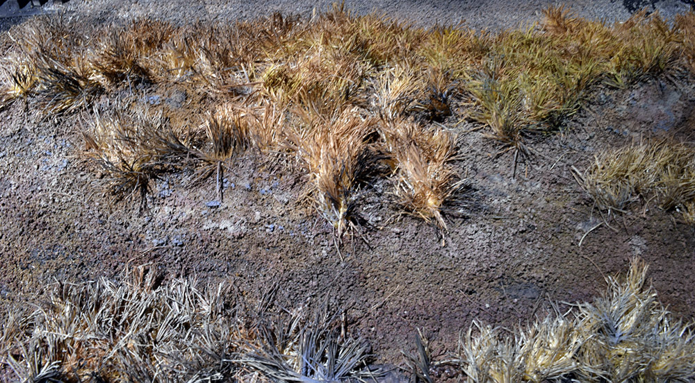
After an overall color treatment, I added highlights to the soil using a small brush and full strength paint in the same colors as the wash coats. I picked out small stones, and did random dry brushing to give the scene a lift. These stronger dots of color make the area pop and add some sparkle. It’s easy to get carried away with this technique and if you go too far, you can come back with more base color to correct any garish spots. This is a technique where you learn to judge the results by doing it. It’ll look crappy at first but over time you’ll develop an eye for what you want. This is also time consuming and I wouldn’t use it everywhere on a large layout. However, it works well for a cameo layout like mine and, like many things in this craft, the results are worth the effort.

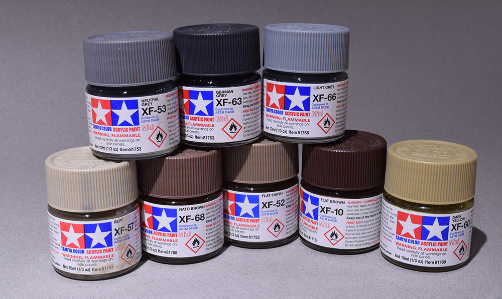
A wash of Flat Earth (XF-52) formed the base color of the soil with the Buff (XF-57) and Nato Brown (XF-68) as accents and variations. The purpose of this wash is to tone down the color of the dirt and provide some highlights to the scene. These colors were carried onto the grass as thin washes and modified with the Dark Yellow (XF-60) and Light and Neutral Grays (XF-66 and XF-53) for the end of season color of frost killed vegetation. Full strength dots of these grays were dry brushed to highlight small details. The German Gray (XF-63) makes a good shadow tone but use it sparingly. It’s an intense color and a little goes a long way.

Details such as rocks are picked out with full strength colors and a small brush. A bit of dry brushing adds variety yet the color tones hold together across the scene.
As a final step, I often sift on a light application of dirt and rub it into the surface to blend everything together. This also gives a dead flat finish. I didn’t do that here because I was happy with the results of the painting.
While this is only an experiment, I’m pleased with what I see and where these techniques can go. This is what I consider a minimum layer of scenery for the layout. There is far more to be done, with additional vegetation, textures and trees. I also want to experiment with color effects such as using gray tones to de-saturate the colors and suggest reflections from an overcast sky. I did this on Mill Road but want to refine the technique. The only real limit to such modeling is your willingness to make the effort.
Too often we get wrapped up in a predetermined outcome and forget that this craft can provide other benefits such as a sense of calm, a release from daily stress and a means of personal expression. Since this is only a test piece, I feel no pressure to meet any standard or expectation. I simply want to play with the materials and see what happens. What I’m discovering is the realization that one can treat a modeled landscape the same way as a two-dimensional landscape painting. You can alter the colors, play with light and shadow to lead the eye and suggest detail where there isn’t any. Combining techniques from one craft into another brings several of my personal interests together and I haven’t enjoyed the work this much in a long time. I want more of that feeling going forward and exploring this craft is a fine way to discover it.
Regards,
Mike
Good morning
As I spend more time working on my Project Victoria On30 layout I’m finding myself considering things like what you’re describing. Part because I’m reading and watching more military diorama modellers media (feeds like Night Shift) and part because of working in O scale means even pieces of grass are themselves large enough to be distinct–that was something I wanted to be doing when I moved up to the larger scale.
We pave an asphalt road through a field. What colour is the road? Black like oil or tar…but that is tempered by the colours of local sands or like aggregates mixed in that temper the colour to make it from “here”. Even this most manmade thing is affected by its environment and I think that’s fascinating. (we see the same in brick)
In nature the sky gives its colour to the water looking up at it. Life on earth lives in a thin median layer between the two so is is mediated by that relationship. Water makes things richer in colour but then the sun shines and washes that colour back out again.
I remember the first time I saw someone paint overtop grass they’d just stuck down. It felt weird and even a little bit wrong. Excuse the word but it felt unnatural to do so. “It was already grass colour!” I thought. Up until then I guess I’d been thinking that grass colours were a palette of colours from Noch or Woodland Scenics just the same way that my paints were a palette of colours from Winsor and Newton or Pantone. Painting and weathering the “actual” models like our trains and buildings seems obvious but we don’t extend that same consideration to the ground they’re in. This, I think, is the most unexplored frontier in model railroading. We’re still in an era of understanding the texture and shape of scenery let alone the spectrum of diversity in its colour and how that changes over time.
Just like you said, I paint the raw foam or plaster base under my layout in browns or greens but now I’m wondering about a grey-black like you did. I see a lot of interesting potential there as a way to unify the base colour under our scenery and everything we build up overtop adjusts the register of that base. I’m going to try this.
Chris
Excuse the word but it felt unnatural to do so. “It was already grass colour!” I thought.
Hi Chris,
I felt the same way when I watched many of the diorama videos. How do you improve on the color of actual dirt? Yet now I see the point, It’s about bringing all these pieces together in a cohesive manner. It’s what separates their modeling from ours. Further, as you’re discovering with your Victoria project, the modeling scale makes a difference too. It’s a fact we often ignore with the over reliance on formulas and using the same products regardless of the context.
Mike
“It’s about bringing all these pieces together in a cohesive manner.”
Exactly! What I was missing was that, to me, I was treating these as distinct works. During one video I was watching (from Martin Kovac’s Night Shift on Youtube) he was building up a diorama base and painting it. It was around the time when he discussed using the same weathering colours on the group as on the tank model that the “why” became so clear and, then, obvious. We need to be painting or at least washing the ground with colours that are shared. That tank got dirty from this dirt, this dirt it’s sitting on, not dirt from somewhere else.
Chris
Iain Rice mentioned the benefits of adding a “unifying tint” to all paints many years ago – possibly decades. Back in the day, when Humbrol enamels were more finely ground and with a higher quality solvent, I used to add a drop of “BR coach grey” (a very light grey) to all the colours I used to paint locos and stick. Never occurred to me to extend it to scenery!
Simon,
It feels obvious once you think about it. Outdoors the atmosphere effects the color of everything. In modeling, we can imply the effect with color.
Mike